Would you like to save this?
There’s a moment in the grocery aisle you’ve lived a hundred times without noticing. Your hand reaches for the jar with the heavy glass and the gold label before your brain has read one word of the ingredients. You already like it. You already trust it, and you’ve decided it’s the good stuff. It’s the same wiring that makes a room turn toward the best-looking person who walks in, the one everyone assumes is also kind and smart and worth knowing. We call it the halo effect, and the food industry has been running it on us since the first can got a prettier label. What follows is a tour through the little tricks on the shelf that make us fall, flirt, and commit to a box of crackers. You will absolutely recognize yourself.
Please note that some of the images in this article were created with the assistance of AI.
13. You Taste the Glossy Pizza Photo With Your Eyes
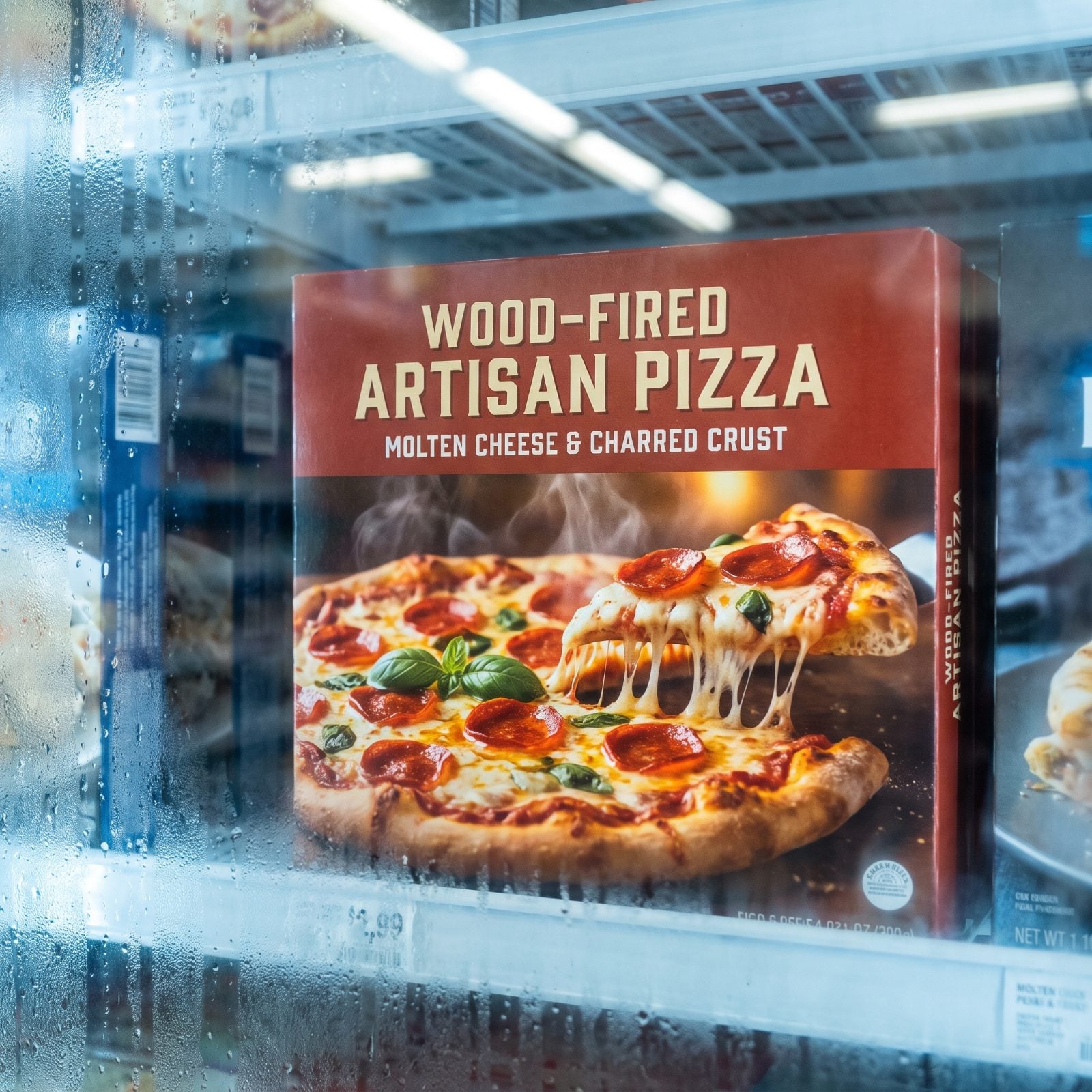
The pizza on the box is steaming, cheese pulling into a perfect golden thread, pepperoni cups holding tiny pools of oil. You can practically smell it. Which is funny, because the actual pizza is a frozen disc somewhere under all that cardboard, pale and flat and waiting.
It’s what happens across a crowded bar when someone catches your eye and you fill in a whole personality from one good angle. The glossy photo isn’t lying exactly. It’s showing you the one best second of this pizza’s life, styled by a professional and lit like a movie star.
Food photographers have whole toolkits for this. Steam from a hidden steamer, glycerin for that just-brushed shine. The brain treats the vivid image as a promise, and we buy the promise.
12. Gold Foil Makes Ordinary Olive Oil Feel Expensive
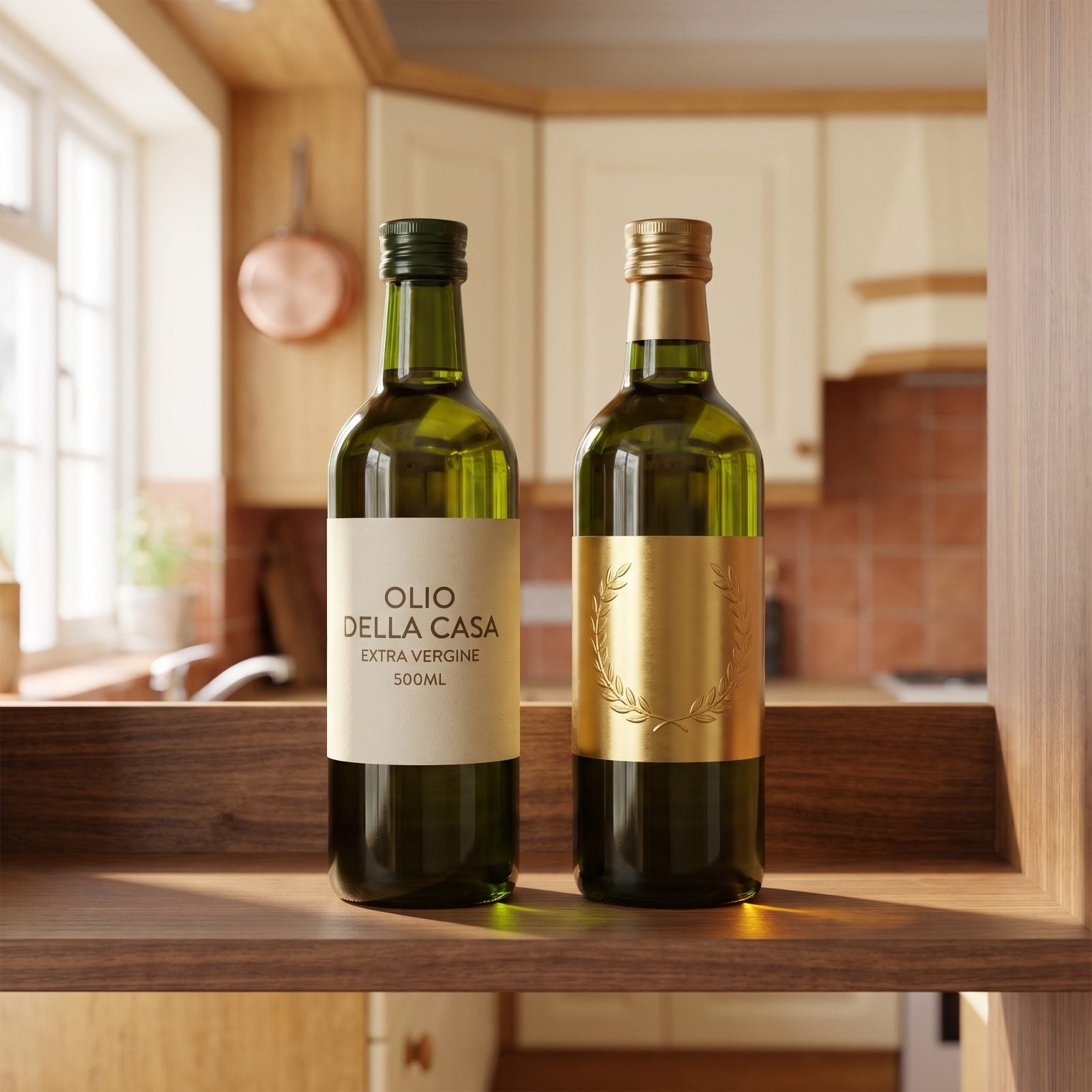
Put two identical olive oils next to each other. Same groves, same press, same oil. Now slap a gold foil label on one and watch which hand reaches first.
Gold reads as effort, as money spent, as somebody who cared enough to dress this bottle up — so surely they cared about what went inside too. It’s the assumption that the well-dressed stranger must have their life together, when really they just own a good jacket.
Metallics trigger a shortcut in the brain that links shine to value, a leftover from when shiny meant rare. That quiet gold label olive oil is charging you for the foil as much as the fruit.
11. A Clear Window Feels Like Instant Honesty
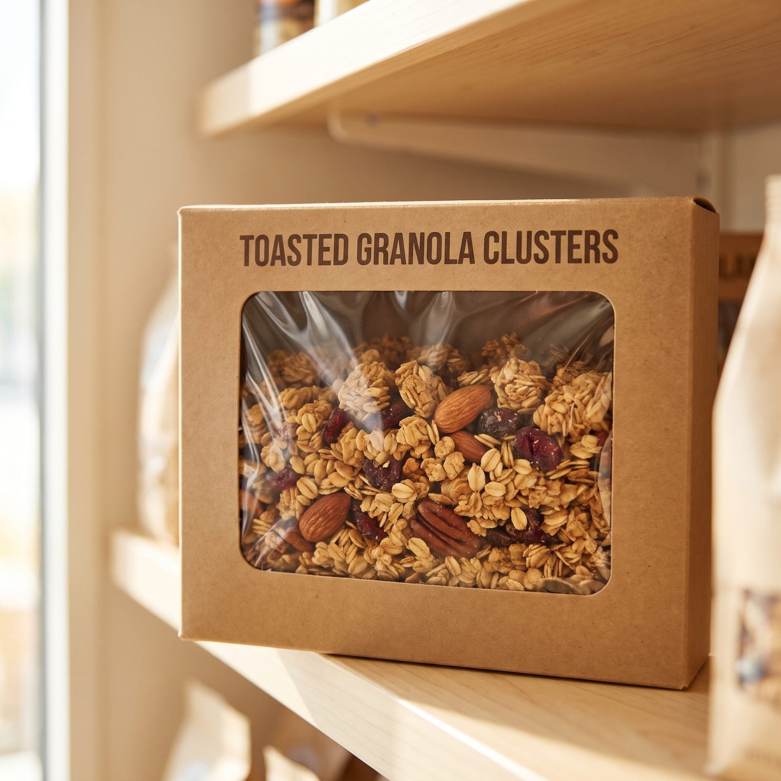
Nothing to hide, says the little plastic window. You can see the granola clusters, the real oats, the whole almonds sitting right there — unlike the sealed box next door that just wants you to take its word for everything.
So you trust the open one more. Of course you do. It’s the reason the person who makes eye contact and tells you a slightly embarrassing story feels more trustworthy than the one giving polished answers. Visible feels honest, even when it isn’t.
Here’s the trick, though. Brands show you the window on the best-looking part. The crushed bits settle to the bottom, out of view. You bought the handful you could see.
What Our Readers Say
- When Piaci Pizza readers disliked a food photo and told us why, the top reason was simply “not for me” at 40%, with the ingredients themselves next at 27%.
From Piaci Pizza reader polls and votes.
10. Kraft Paper Convinces You the Crackers Are Wholesome
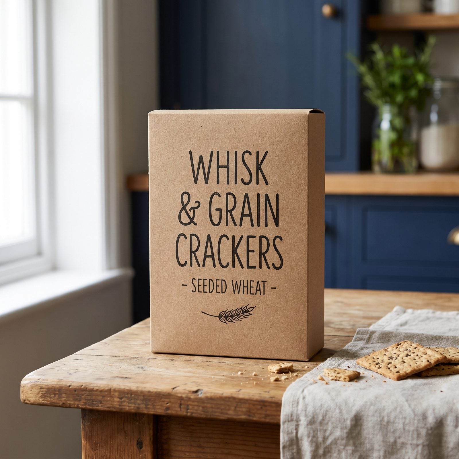
Brown paper has done more for the health-food aisle than any actual ingredient ever could. The rough kraft texture, the little wheat sprig drawing, the ink that looks almost hand-stamped — you read all of it as natural and simple and good for you, before you’ve glanced at a single thing on the panel.
Flip the box. Sometimes those kraft-paper crackers carry the same sugar and oil as the loud shiny ones. The paper did the lying for them.
It works because color and texture carry meaning faster than words do. Brown says earth, farm, honest. We trust the costume.
9. Heavy Glass Jars Impress You Before the Ingredients Do
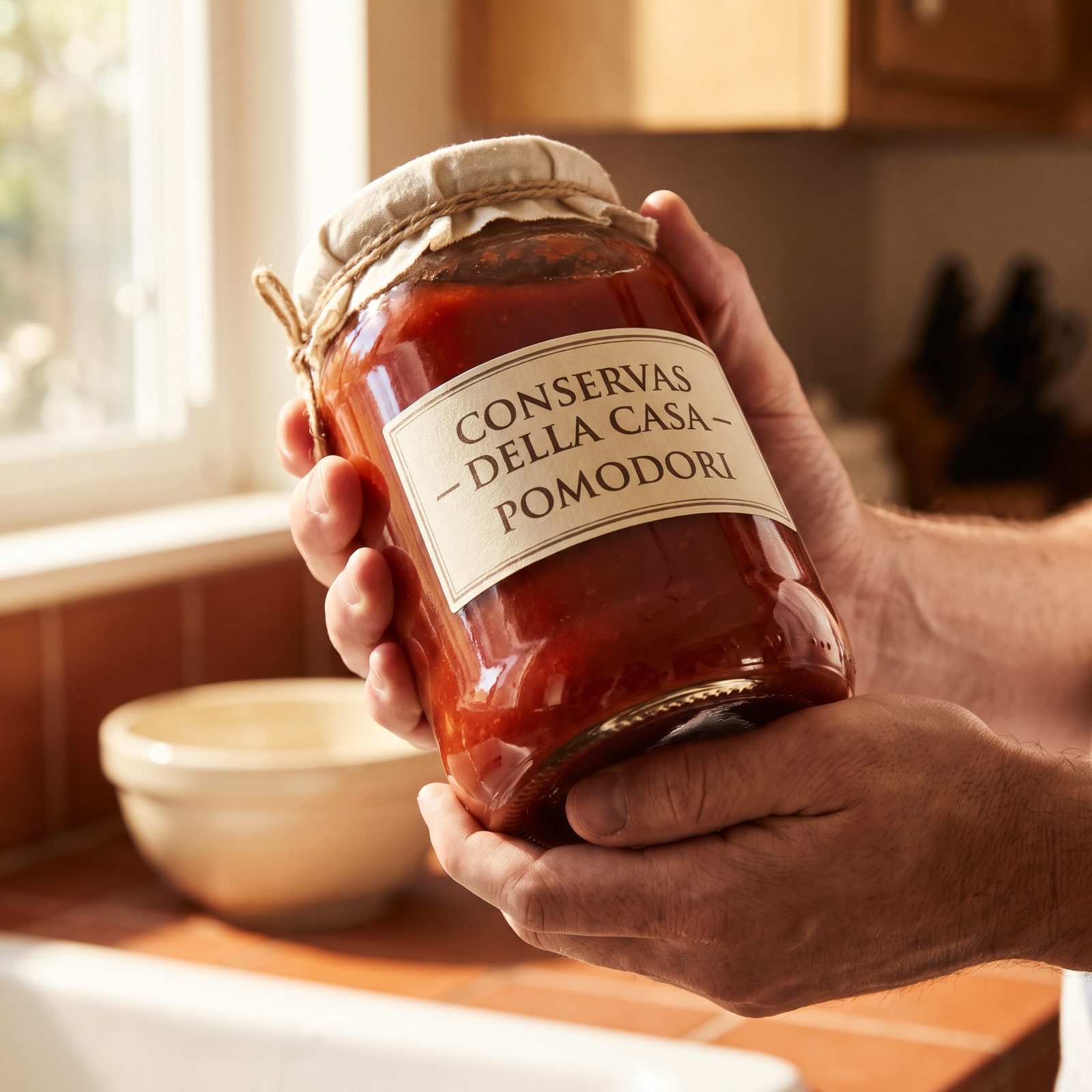
Pick up the premium pasta sauce and the cheap one at the same time. The good one is heavier. Thick glass, a solid base, a satisfying heft as it leaves the shelf, and your hand registers quality before your eyes read a word.
We do the same thing with people. A firm handshake, good posture, someone who takes up space with ease, and we assume a competence that may or may not actually be there. Weight signals substance. Our brains have never fully updated that rule.
The frustrating part? The weight usually lives in the packaging, not the product. Thicker glass, heavier lid, identical tomatoes. That handsome heavy glass jar pasta sauce charged you for the gravity.
8. Odd-Shaped Bottles Win Attention Without Saying Anything
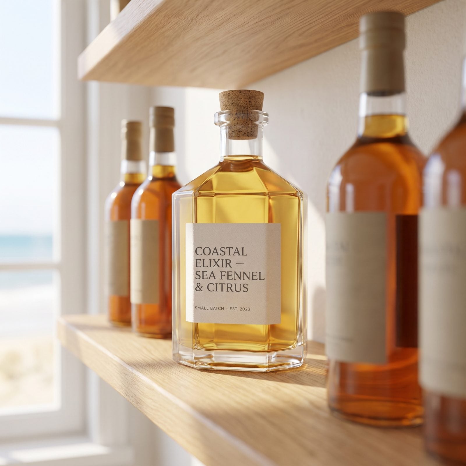
A shelf of bottles is a shelf of soldiers — same height, same shoulders, same squat uniform. Then one bends differently, a strange curvy silhouette that doesn’t match the lineup, and your eye snaps to it like a magnet.
That’s the stranger across the party who dresses just outside the dress code. Not louder. Just different, and different fires the same signal to our attention: look here, this one’s interesting.
The shape says nothing about the salad dressing inside. It doesn’t taste more like anything. But novelty is catnip to human attention, and the weird bottle got the thing every product fights for, which is one second of your gaze.
7. Award Medals Let Other Shoppers Flirt for You
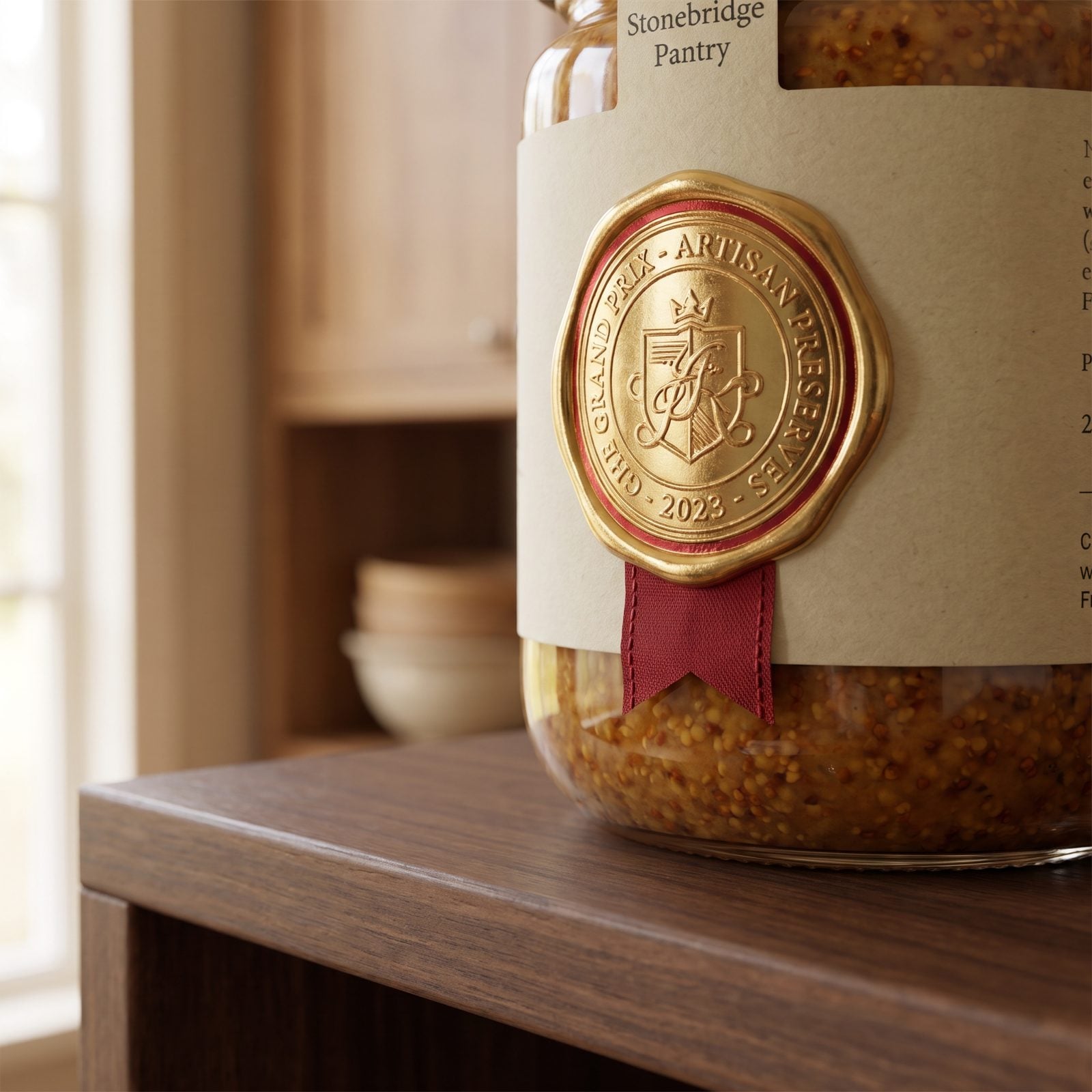
That little gold medal on the mustard jar is doing something sneaky. It’s a tiny crowd of strangers vouching for the product before you’ve tasted it. Some panel somewhere liked this. Other people already approved, so why wouldn’t you?
We call it social proof, and it works like a friend nudging you at a party saying trust me, that one’s great. You relax your guard. Somebody vetted this already, so you don’t have to.
The catch is you rarely know what contest, what year, or how many entries there were. A medal from a tiny county fair reads the same as a prestigious one. The brain sees the badge and files it under approved.
6. Limited-Edition Cookies Create a Now-or-Never Crush
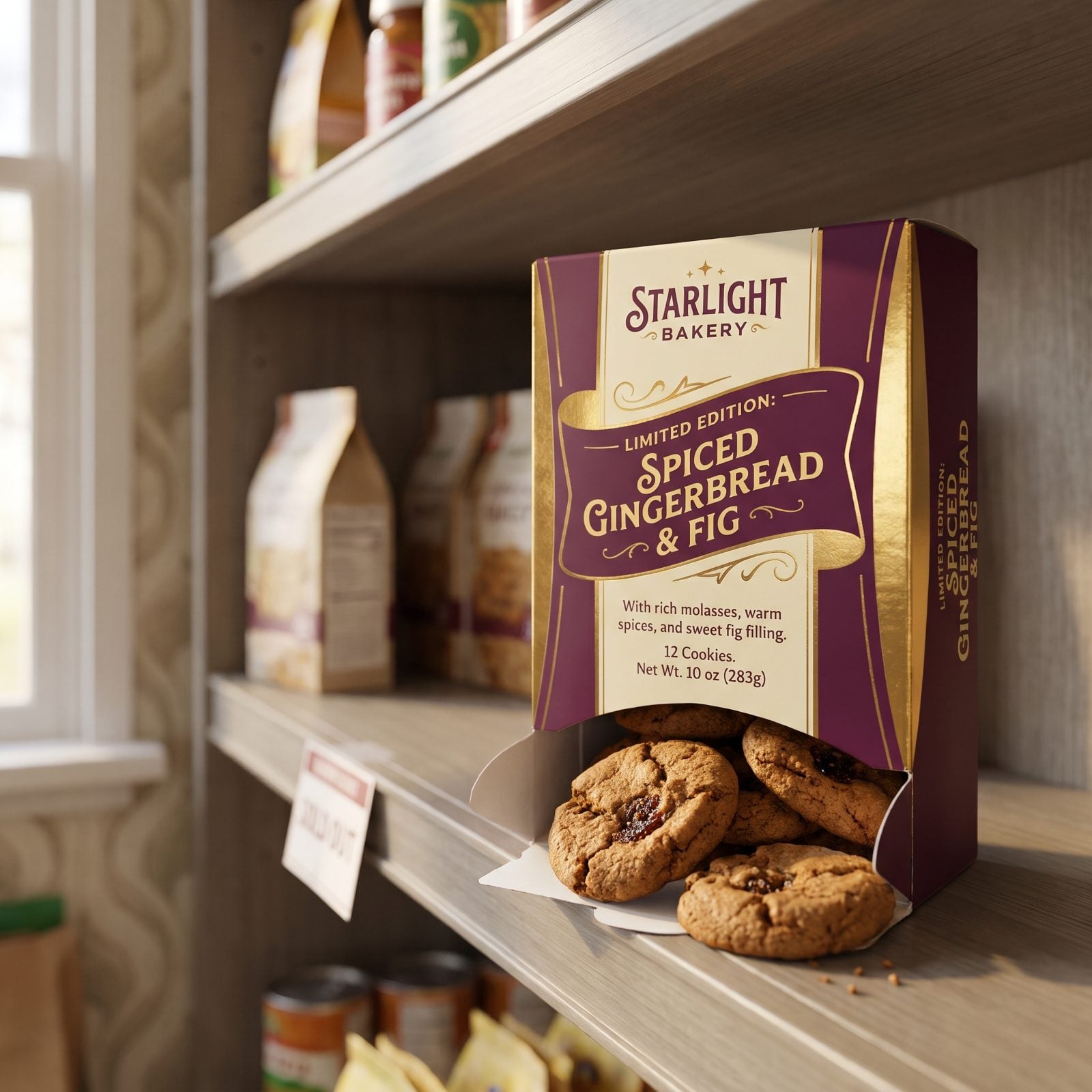
Only here for a little while. The box practically whispers it. Seasonal flavor, special edition, back for a limited time — and suddenly a cookie you’d normally stroll right past feels urgent.
Scarcity flips a switch. The thing you can’t always have becomes the thing you want most, which is the exact pull of the person who’s leaving town Sunday. The clock makes the heart reckless.
Loss aversion is the engine underneath it all. We hate missing out more than we enjoy getting, so now-or-never beats whenever-you-like every single time. The cookies aren’t better. They’re just leaving, and that alone moves them off the shelf.
5. A Familiar Logo Feels Safer Than a Better Label
Would you like to save this?
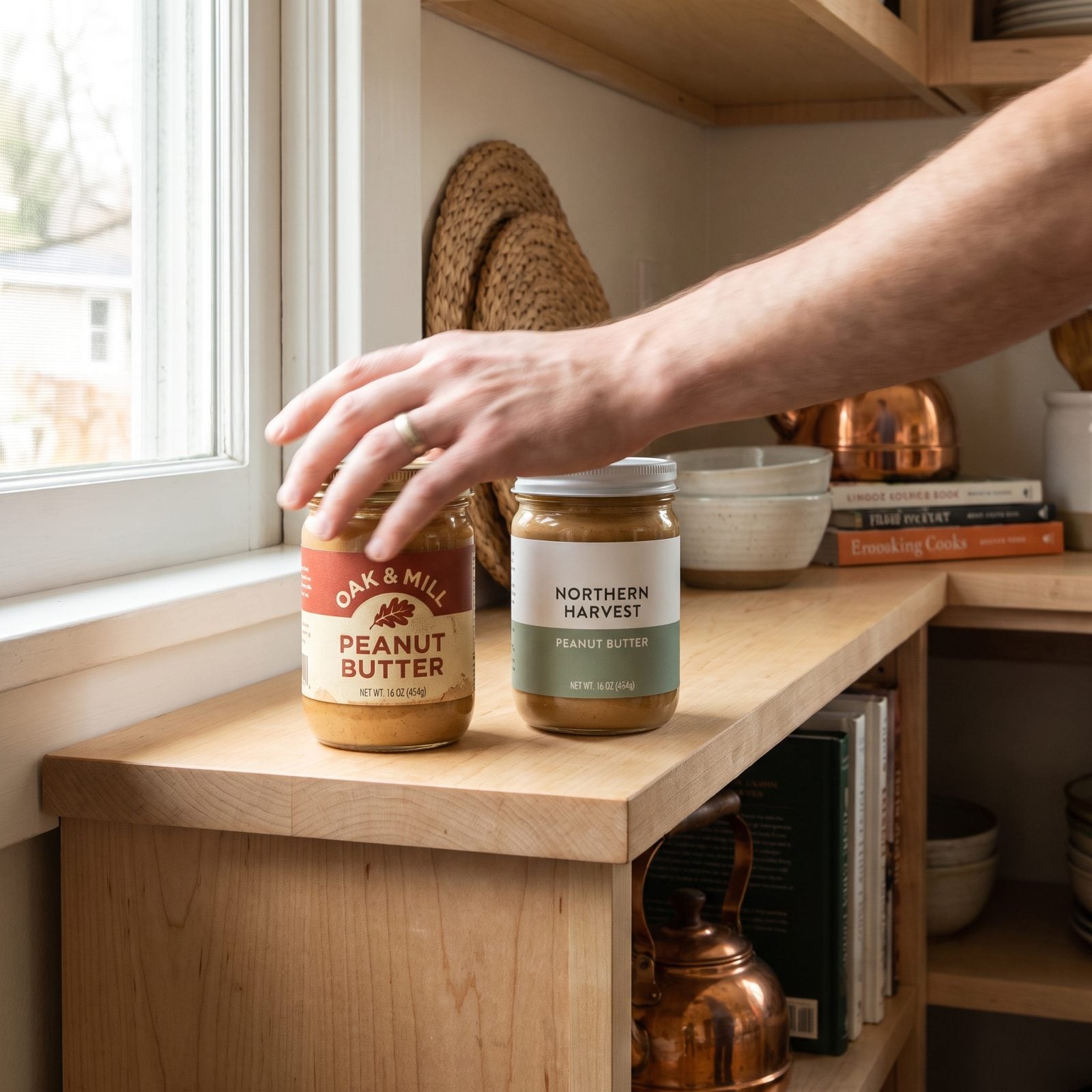
There’s a jar you’ve bought since forever. The label hasn’t changed much. Beside it sits a newer brand with cleaner design and maybe even better ingredients, and your hand drifts right past it to the old familiar one anyway.
Familiarity feels like safety. We mistake recognition for trust all the time, in the aisle and in people, which is why we stay loyal to what we already know instead of taking a chance on the better-looking stranger.
Psychologists call it the mere-exposure effect. The more we’ve seen something, the more we like it, for no reason beyond having seen it. The familiar logo wins not because it’s better but because it’s comfortable — and comfort is a powerful thing to compete against.
4. Retro Cereal Boxes Let Childhood Choose Breakfast
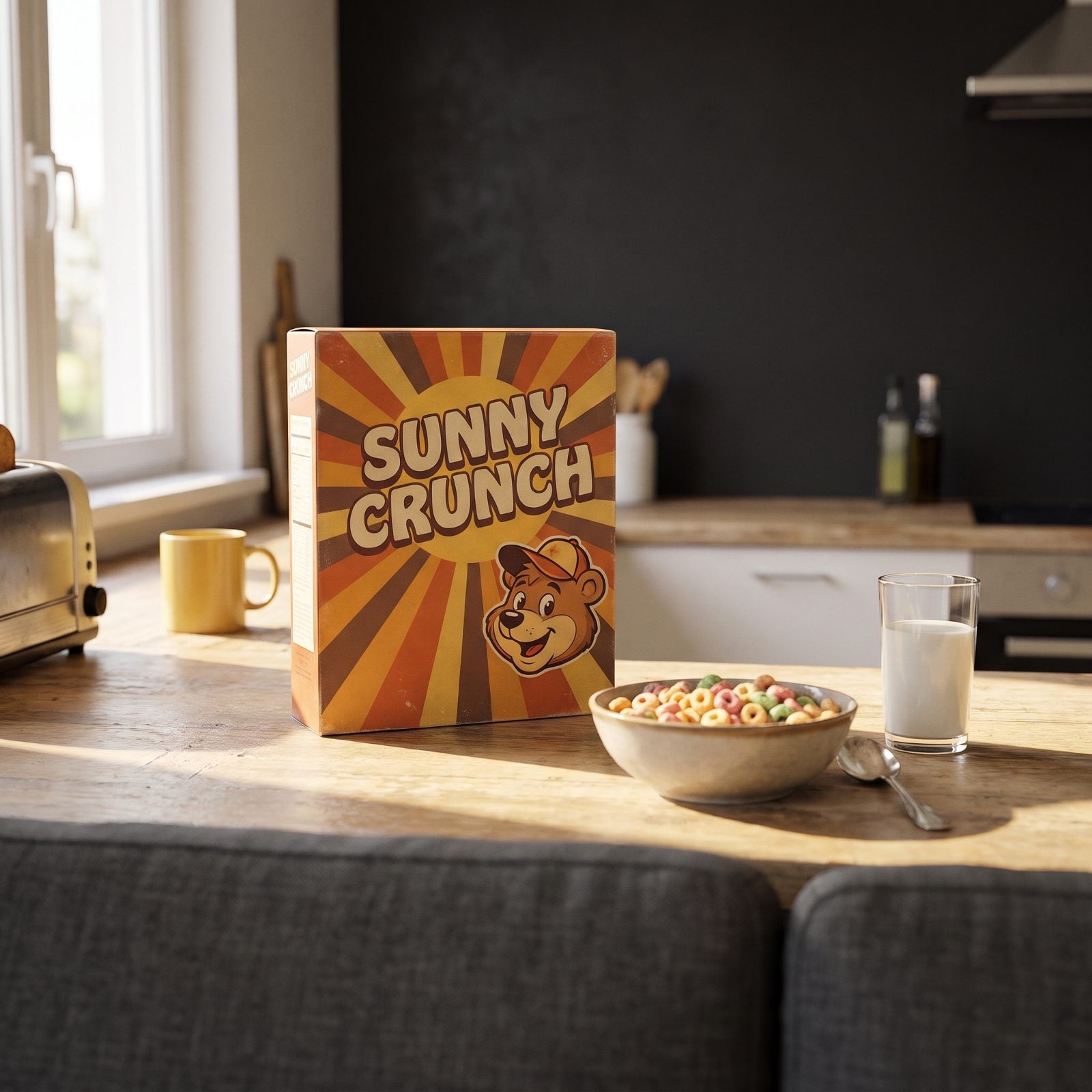
The retro cereal box with the chunky seventies lettering and the sunburst graphics isn’t selling you breakfast. It’s selling you a Saturday morning in footie pajamas, cartoons on, nobody making you do anything yet.
Nostalgia slips right past the ingredient panel and into the warm part of your memory. The design pulls a feeling, and the feeling makes the decision while your rational brain is still squinting at the sugar content.
Same gravity that pulls you toward someone who reminds you of a happier, simpler stretch of your life. You’re not choosing them, exactly. You’re choosing who you were back then.
When our readers loved a food photo and tapped a reason, “nostalgic” came up 20% of the time, second only to “comfort” at 25%.
3. Italian Script Makes Supermarket Sauce Feel More Authentic
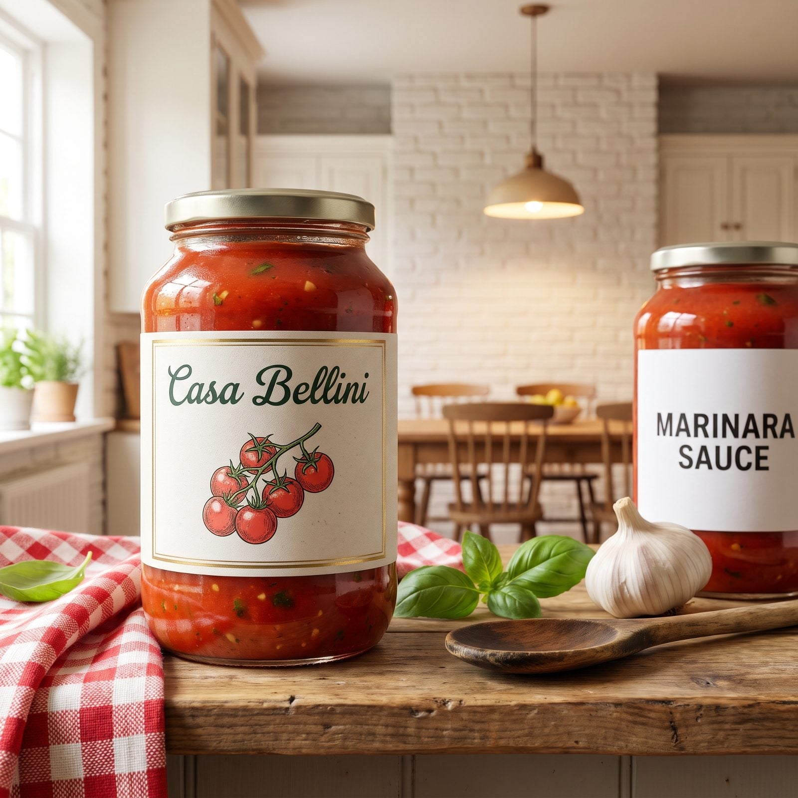
You’ve stood in the sauce aisle with two jars. One spells the name in plain block letters; the other writes it in loopy green script that curls at the end of every word like a signature on an old postcard. You reach for the script. Same tomatoes, same factory, same forklift that loaded the truck — but that handwriting whispered nonna, and you believed it.
It’s the same reflex that makes a stranger with an accent seem fascinating before they’ve said anything worth hearing. We read style as substance. The curve of the letters stands in for a grandmother who never existed, a village you’ll never visit, a recipe actually written by a food scientist in an office park somewhere off a highway.
Psychologists call it the halo effect. One attractive trait — the script — spills over and colors everything else. If the lettering looks authentic, the sauce must taste authentic, and the brain happily skips the ingredient list.
2. “Small Batch” Gives Mass-Made Jam a Better Backstory
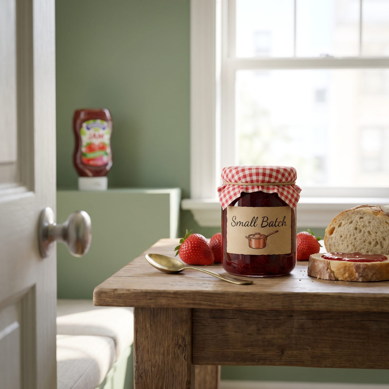
Two jars of strawberry jam. Identical fruit, identical sugar, identical conveyor belt somewhere in Ohio. One wears a plastic lid and a barcode. The other has a kraft-paper label, a square of gingham tied over the top with twine, and the words small batch hand-lettered like a secret you were trusted with.
You pay a dollar more for the one that sounds like it was stirred in a copper pot by someone who cares about you. Nobody stirred anything. “Small batch” has no legal meaning. The batch was enormous.
It works because a good backstory does the heavy lifting the product can’t. You’ve watched it happen with people — the charming origin story, the hard-luck past, the artisan hands — and suddenly you’re overlooking the fact that nothing here has been verified. The narrative feels like proof.
Scarcity and intimacy got bottled together, and we drink it down with the toast.
1. Eco Symbols Make the Whole Brand Seem Kinder
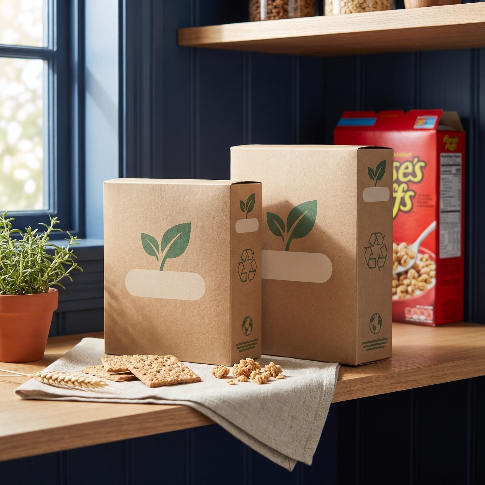
A little green leaf. A circle of chasing arrows. A font that looks like it was printed on recycled paper by a company that composts its own lunch scraps. Suddenly the crackers taste more virtuous and you feel like a better person for buying them — which is a strange thing to feel about crackers.
Half those symbols mean nothing. Anyone can print a leaf. The box might not be recyclable in your town, the arrows might cover one layer of packaging, and the earthy brown cardboard got chosen in a design meeting over coffee. But the signal landed, and one good trait made the whole brand feel kind and honest and on your side.
Same wiring makes us assume a warm, open face belongs to a warm, open heart. We extend trust to the surface and hope the inside matches. Sometimes it does. Often the packaging is just dressed for the part.