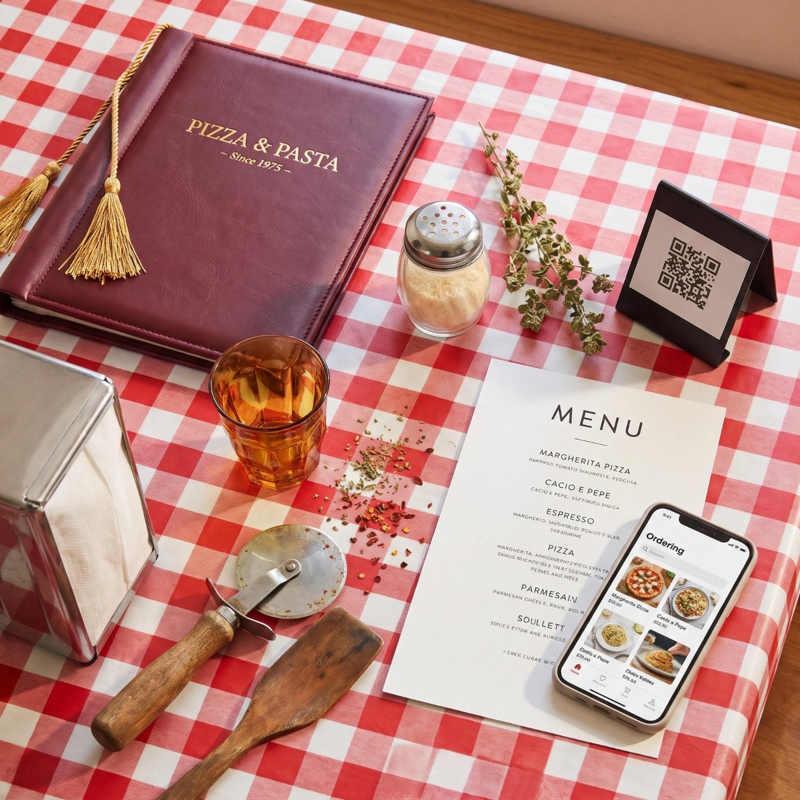
The menu landed on your table with a soft thwack, heavy as a hymnal, gold tassel swinging. You cracked it open and the smell of plastic and marinara drifted up. A Large Supreme ran you under six bucks, the waitress called you hon, and she let you flip through all fourteen pages while your little brother built a tower out of sugar packets. Fifty years later you scan a QR code off a sticky table tent and squint at a phone. We pulled both menus side by side to see exactly what got lost, and what got cleaner.
Please note that some of the images in this article were created with the assistance of AI.
39. Menu Prices: 1975 Dinner Costs vs. Today’s Totals
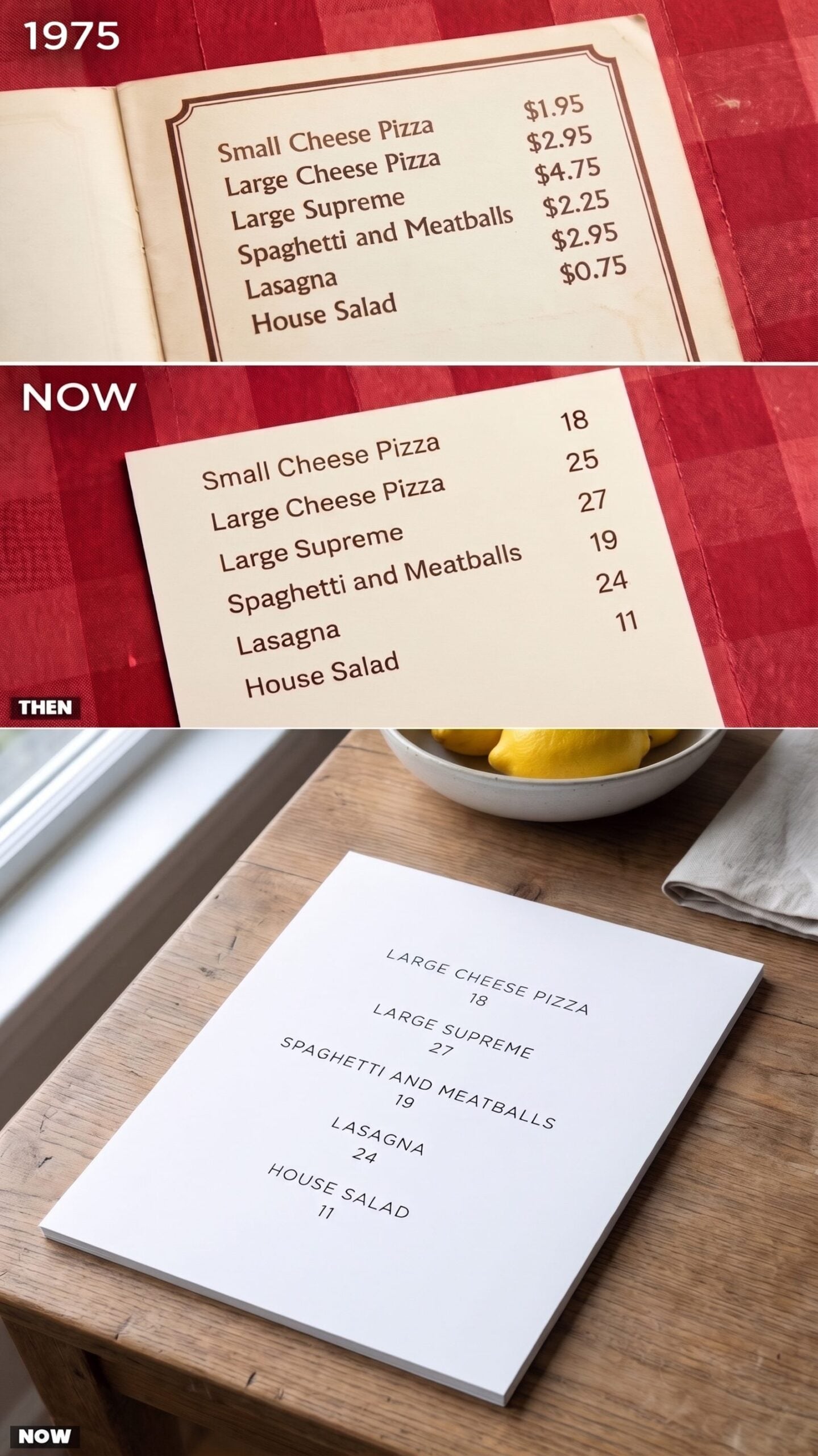
A Large Cheese Pizza for $2.95. Read that twice. In 1975 the whole family ate for what one pie costs now, tax and tip included, and nobody blinked.
The modern sheet lists the same dishes and quietly asks for 18, 24, 27. Same lasagna, roughly. Different decade, very different damage. What strikes you isn’t just the inflation, it’s how proudly the old menu showed its cents. Ninety-five cents meant something. Today the number stands there naked, rounded off, hoping you won’t do the math.
38. Menu Covers: Detailed Period Artwork vs. Minimalist Branding
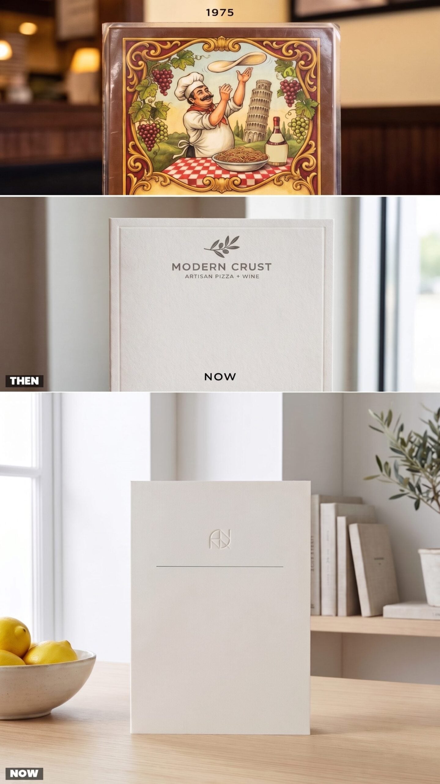
The old cover was a painting you could eat off of. A chef mid-toss, grapevines curling around the border, a little Leaning Tower winking in the corner. Somebody drew every inch of it, and it told you before you ordered that this place cared.
Now the cover is a breath of empty cream stock with one tiny mark floating near the top. Confident, sure. Expensive-looking, even. But you don’t fall in love with white space the way you fell for that painted chef.
37. Menu Construction: Padded Vinyl Binders vs. Disposable Cardstock
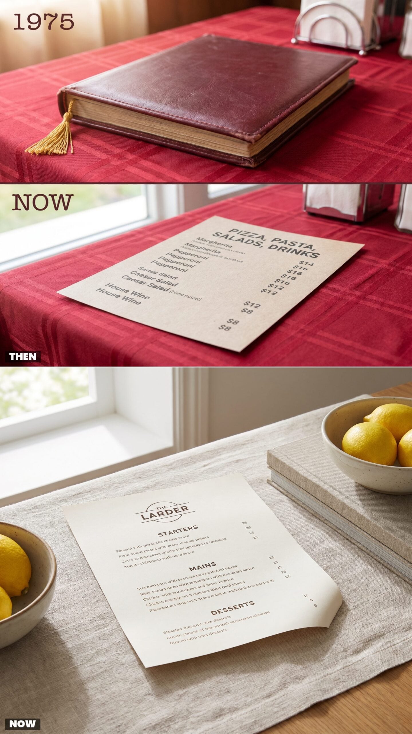
You could prop a door with a 1975 menu. Padded vinyl, stitched edges, a gold tassel you’d fiddle with while deciding, it had heft and a little give when you pressed it, like a diner booth.
What you get handed today is one sheet of cardstock that curls at the corner and goes in the recycling before you’ve paid. Cheaper for the owner, I get it. But there was something about that binder landing on the table. A small ceremony. You don’t get a thwack from a piece of paper.
36. Menu Dimensions: Oversized Multi-Page Books vs. Compact One-Sheet Menus
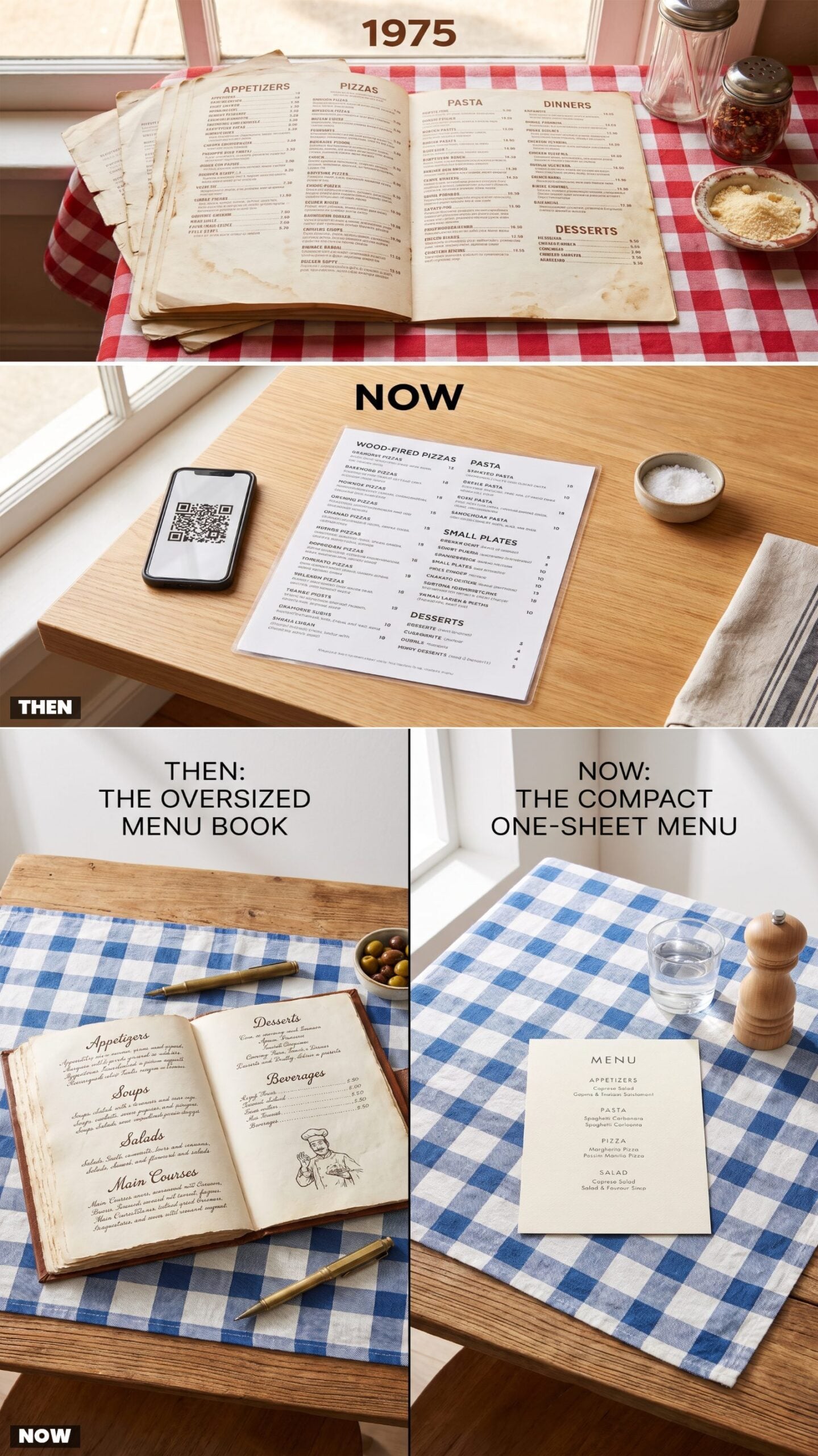
Fourteen pages. Maybe sixteen. You’d flip past the appetizers, past four kinds of pasta, past the dinner platters, past a dessert page with a photo of spumoni, and you still hadn’t decided. The 1975 menu was a book, and reading it was half the fun.
Today’s menu is one sheet you absorb in ten seconds. Pizza, a few pastas, a salad, done. Efficient. But you lose the browse. You lose that feeling of flipping back to page three because the manicotti suddenly sounded better than the pizza.
35. Typography: Decorative Display Fonts vs. Clean Sans-Serif Type
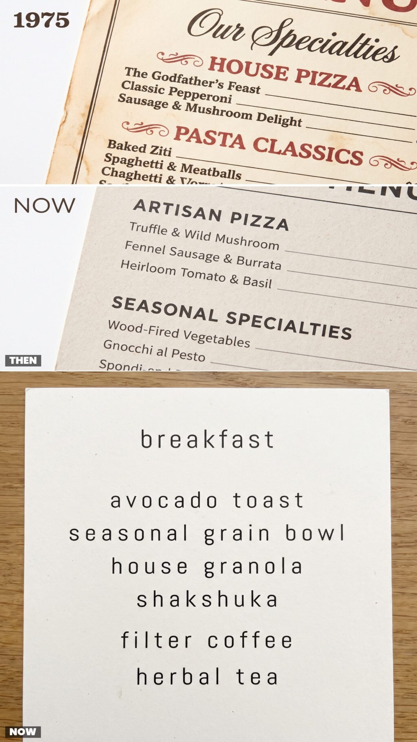
Every category got its own personality in 1975. A loopy script for the specialties, a fat slab-serif for the pizzas, little curlicue flourishes crammed into the corners. It was loud. It was a lot. It also told you exactly what kind of night you were in for.
The modern menu whispers in one tidy sans-serif, lowercase and spaced out like it’s trying to seem calm. Readable, yes, I’ll give it that. But I miss a menu that had a little swagger in its lettering.
34. Color Palettes: Harvest Gold and Brown vs. Neutral Modern Tones
Chocolate Brown
Avocado Green
Tomato Red
Cream Stock
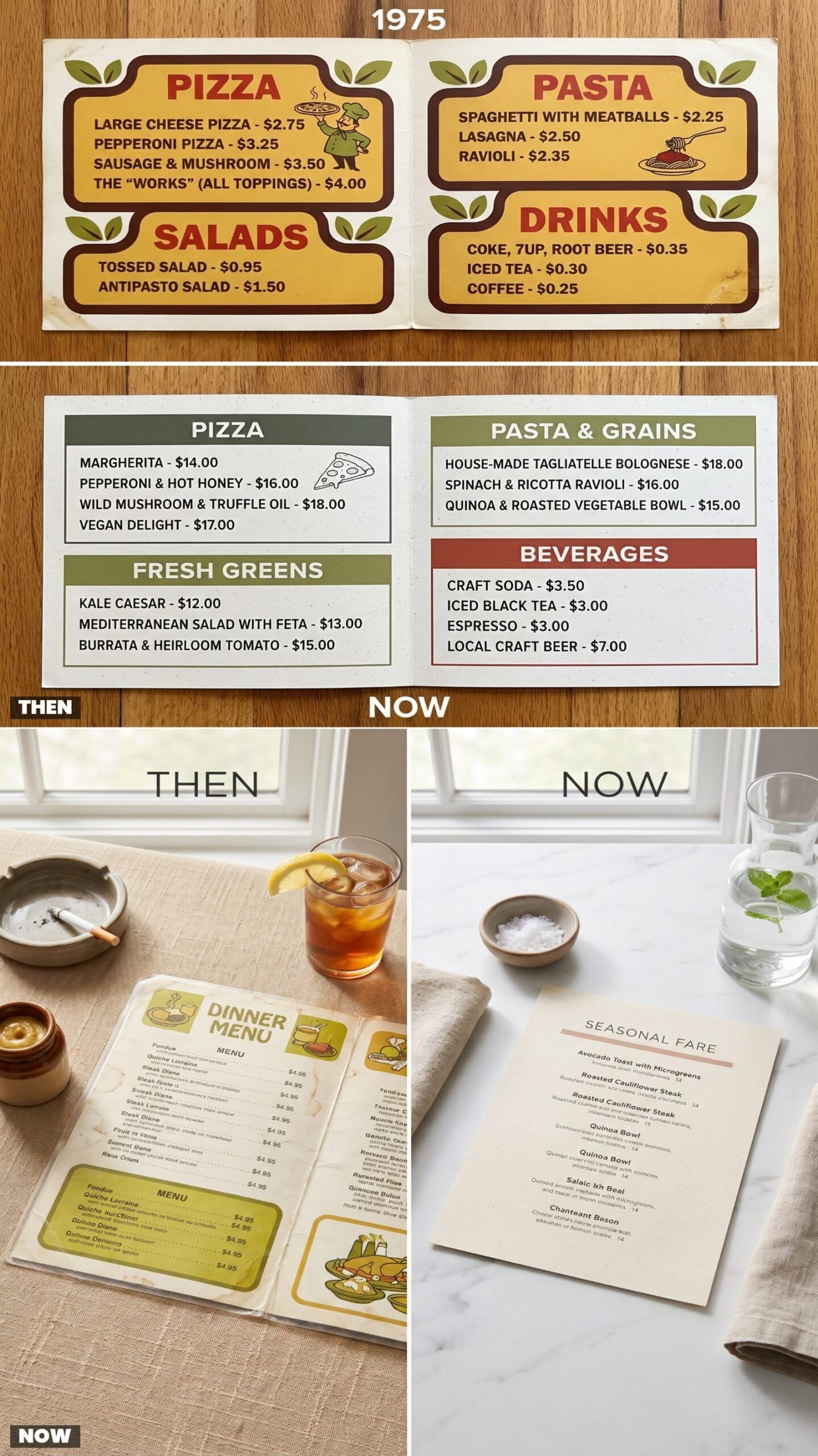
Harvest gold, chocolate brown, a dash of avocado green. The 1975 menu wore the same colors as your kitchen, your station wagon, and your neighbor’s shag carpet, all warmth and earth, saturated like a pot of sauce left simmering.
Today everything’s gone cool and quiet. White, warm gray, one polite sage accent if the place is feeling bold. It looks expensive. It also looks like every other menu in town.
33. Food Photography: Rare Staged Pictures vs. Full-Color Close-Ups
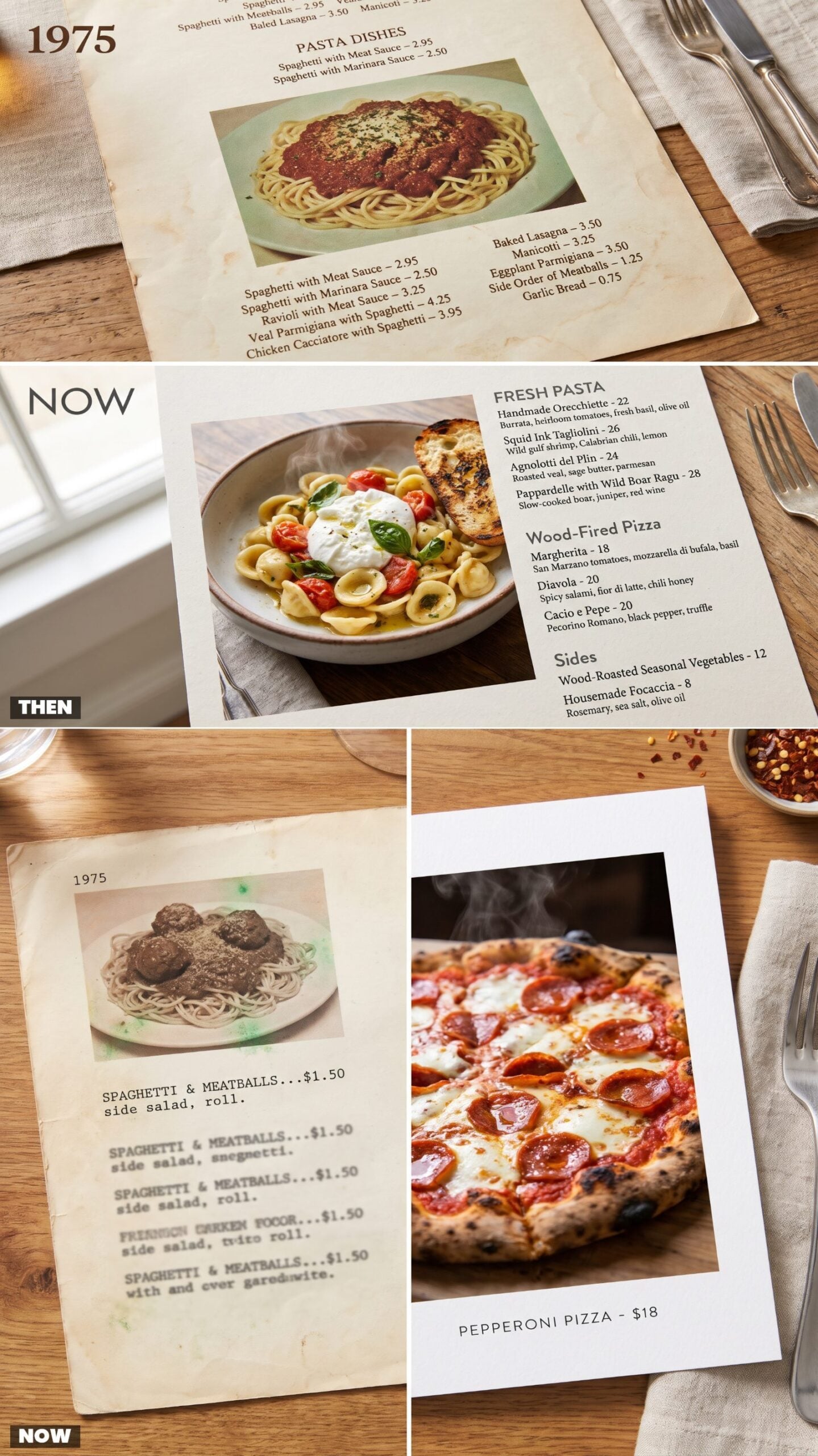
Pictures were rare and, honestly, not great. A 1975 menu might carry one lonely photo of spaghetti, over-garnished and lit flat, the color gone slightly green in the printing. You half-didn’t trust it, and you were right not to.
Now the photo is the whole page. Glossy sauce, visible steam, every char mark on the crust in sharp focus. It sells harder than any waitress ever did. Does the real thing look like that? Rarely. But you order it anyway, and that’s exactly what they’re counting on.
What Our Readers Say
- When Piaci Pizza readers loved a food photo and tapped a reason, comfort came out on top at 30%, with nostalgic and ingredients each at 17%.
- Food photos with a timeless look got more hearts from our readers than the other images in the same articles, 84% versus 79%.
From Piaci Pizza reader polls and votes.
32. Dish Illustrations: Hand-Drawn Entrees vs. Digital Icons
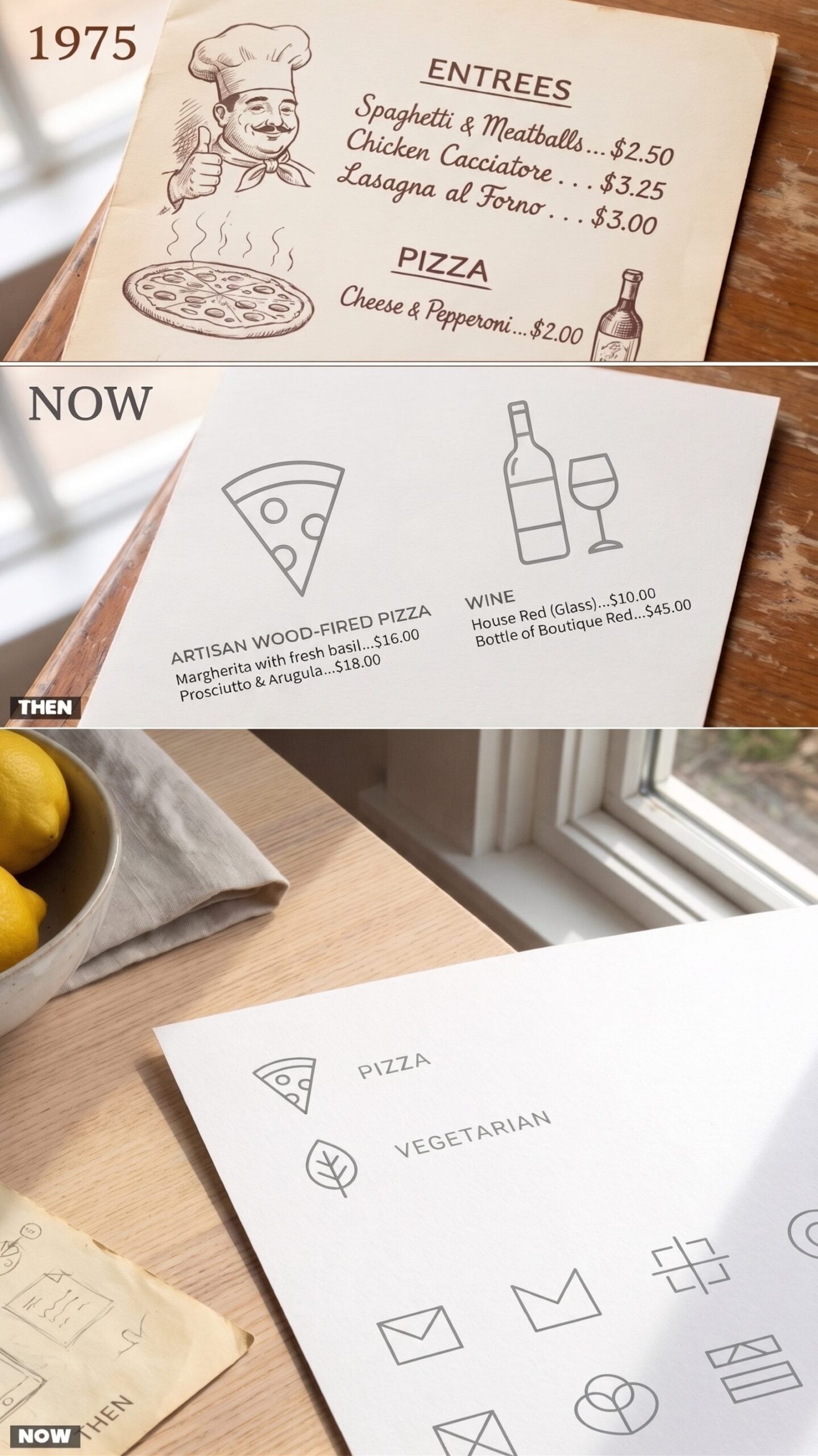
Somebody with a pen and real talent drew the little pizza on the old menu, steam rising in wavy lines, a cartoon chef giving a thumbs up near the dinner section. It wasn’t accurate. It was personality, inked by hand.
The modern menu uses icons instead. A flat line-drawn slice, a geometric leaf for the vegetarian stuff, all uniform, all made on a screen. Useful at a glance. Soulless up close. The old sketch looked like a person made it, while this looks like it came out of a dropdown.
31. Page Layouts: Dense Columns vs. Generous White Space
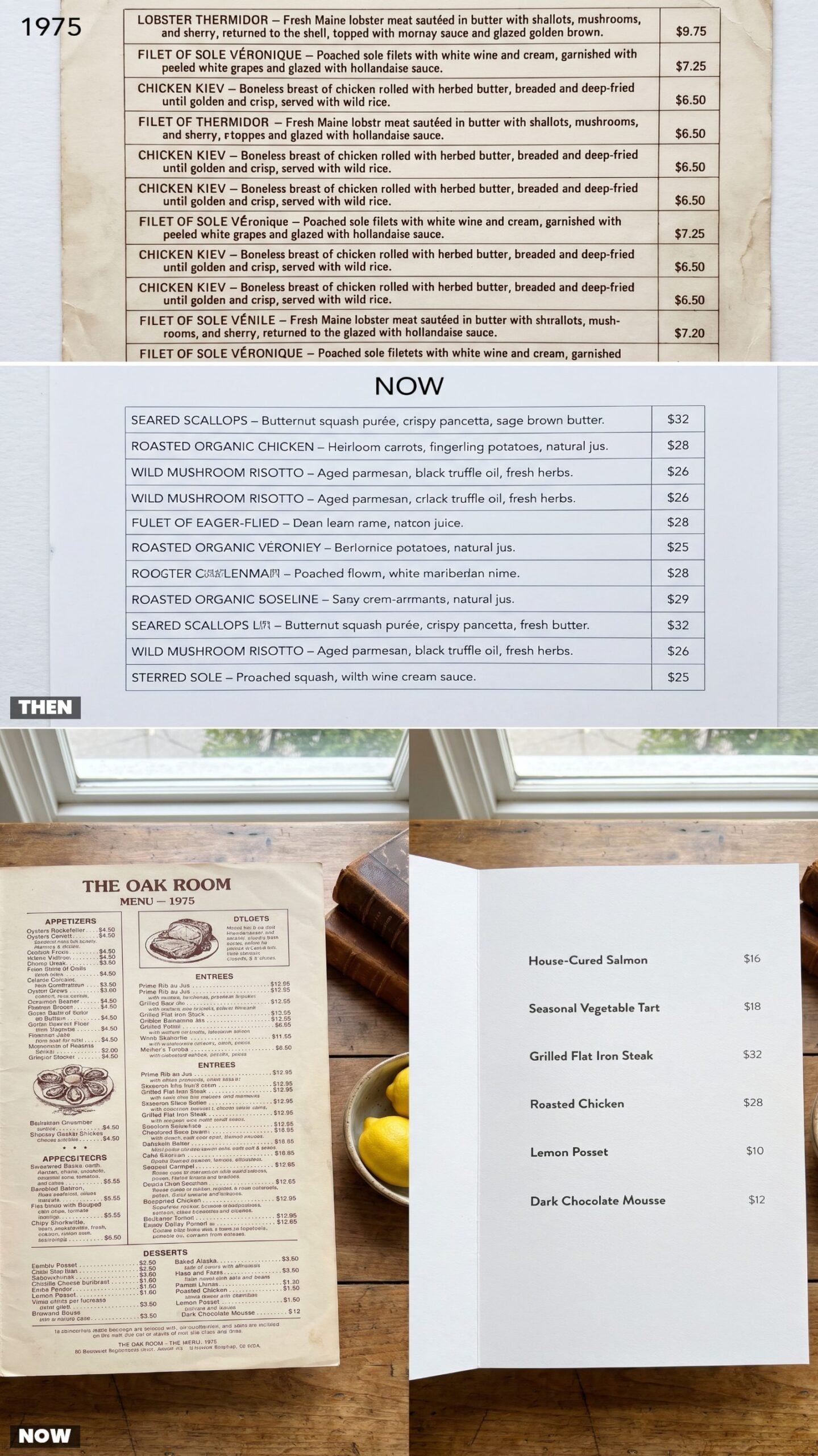
The 1975 page didn’t waste a square inch. Every dish got a full description, justified columns ran wall to wall, thin rules divided the sections, and the prices lined up on the right like soldiers. It was a lot to read, and reading it felt like getting your money’s worth before the food even came.
Modern menus do the opposite. Six dishes, acres of white space, a short name and a bare number. It breathes. It also tells you almost nothing, which I think is on purpose.
A crowded 1975 menu made you feel abundant before you ordered. An airy modern one makes you feel like you’re at an art gallery that happens to serve pasta.
30. Price Formatting: Dollar Signs and Cents vs. Bare Whole Numbers
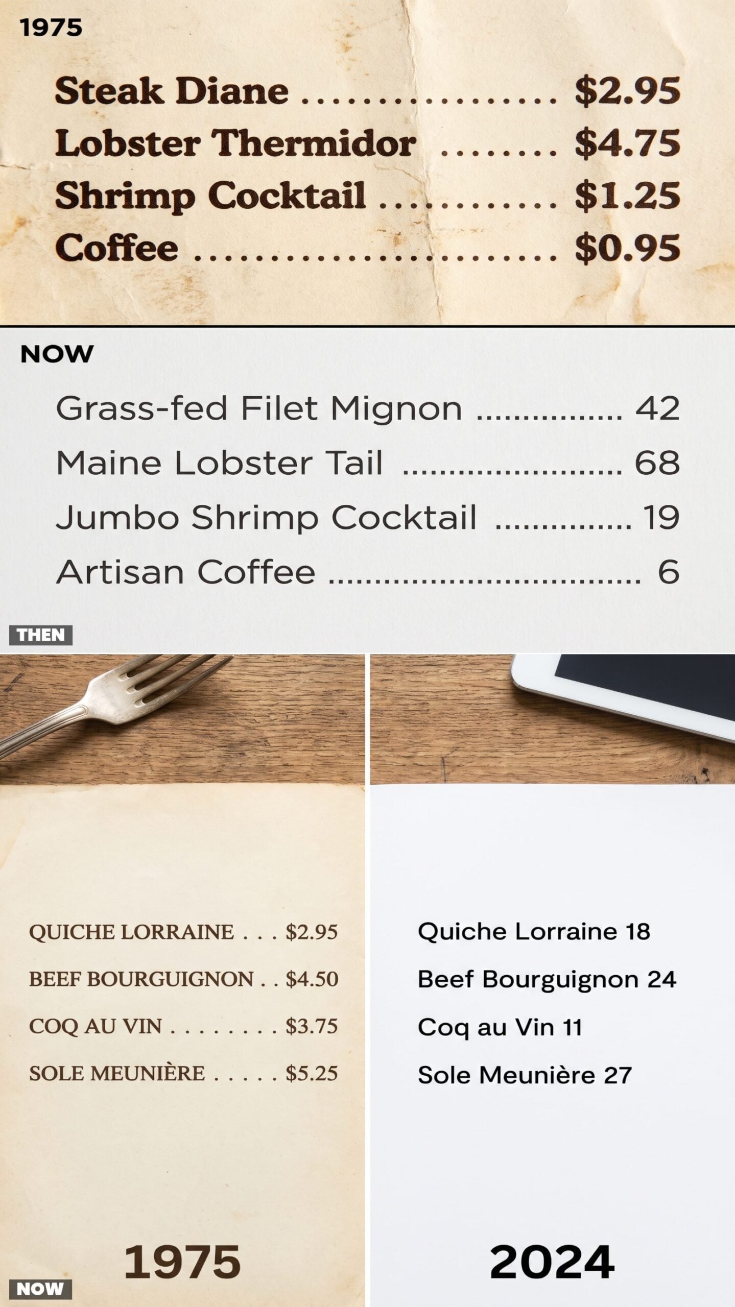
A 1975 price committed to the bit. $2.95, dollar sign proud, cents and all, with a dotted leader line walking your eye straight from the manicotti to the number. No ambiguity. You knew exactly what the night would cost down to the nickel.
The trick on the modern menu is subtraction. Drop the dollar sign, drop the cents, and 24 feels less like money than $24.00 does. Restaurants figured out that a bare number hurts less. It’s a small psychological nudge, and it works on all of us.
29. Complete Dinners: The Soup-to-Dessert Package vs. Building Your Own Bill
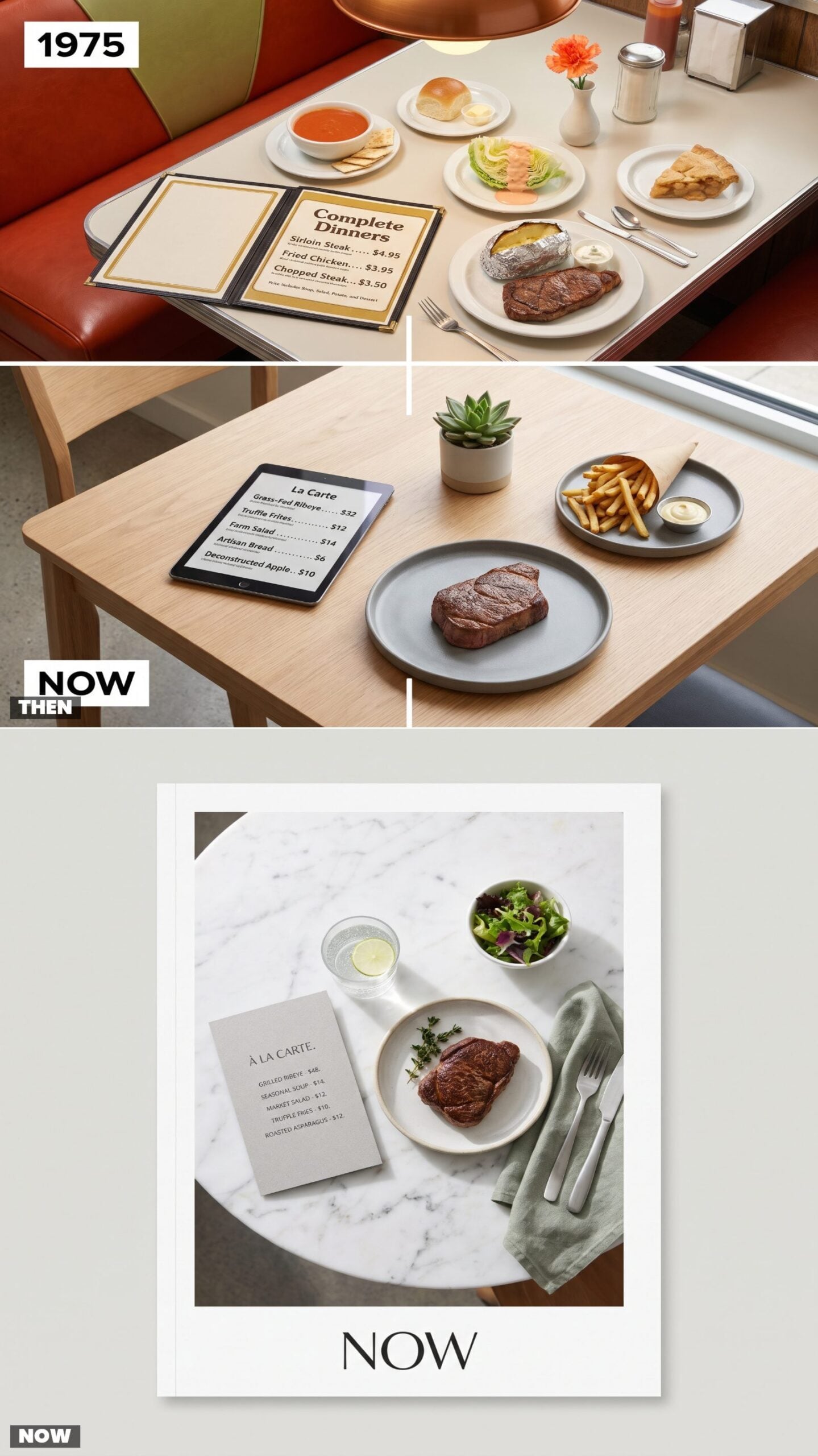
Back then you ordered the word ‘dinner’ and it meant everything. One price bought you soup or juice, a crisp iceberg salad, your entree, a potato, and a dessert you didn’t choose so much as receive. The waitress didn’t ask follow-up questions, and the pie was already decided.
Now the entree is the entree. Soup costs extra, salad costs extra, and the side you assumed came with it rings up on its own line. Dessert is a whole separate decision you make after you’ve already seen what one plate cost. I miss the honesty of that old package, even if the steak was overcooked half the time.
28. Daily Specials: The Typed Paper Insert vs. The Screen That Won’t Sit Still
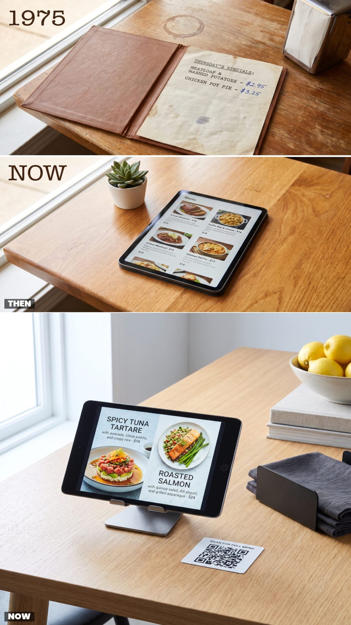
Specials used to arrive on a sheet someone typed that morning, keys sticking, a word or two struck over with x’s. You could tell what day it was by what was listed, since Friday meant fish. The price was penciled in because it changed with whatever came in cheap.
Today the special glows, rotates, and loops a video of itself before you’ve finished reading it. By the time you decide, the screen has moved on to a cocktail you didn’t ask about. Faster, sure. But a typed insert never interrupted your train of thought mid-sentence.
27. Appetizers: The Shrimp Cocktail and Relish Tray vs. The Shareable Small Plate
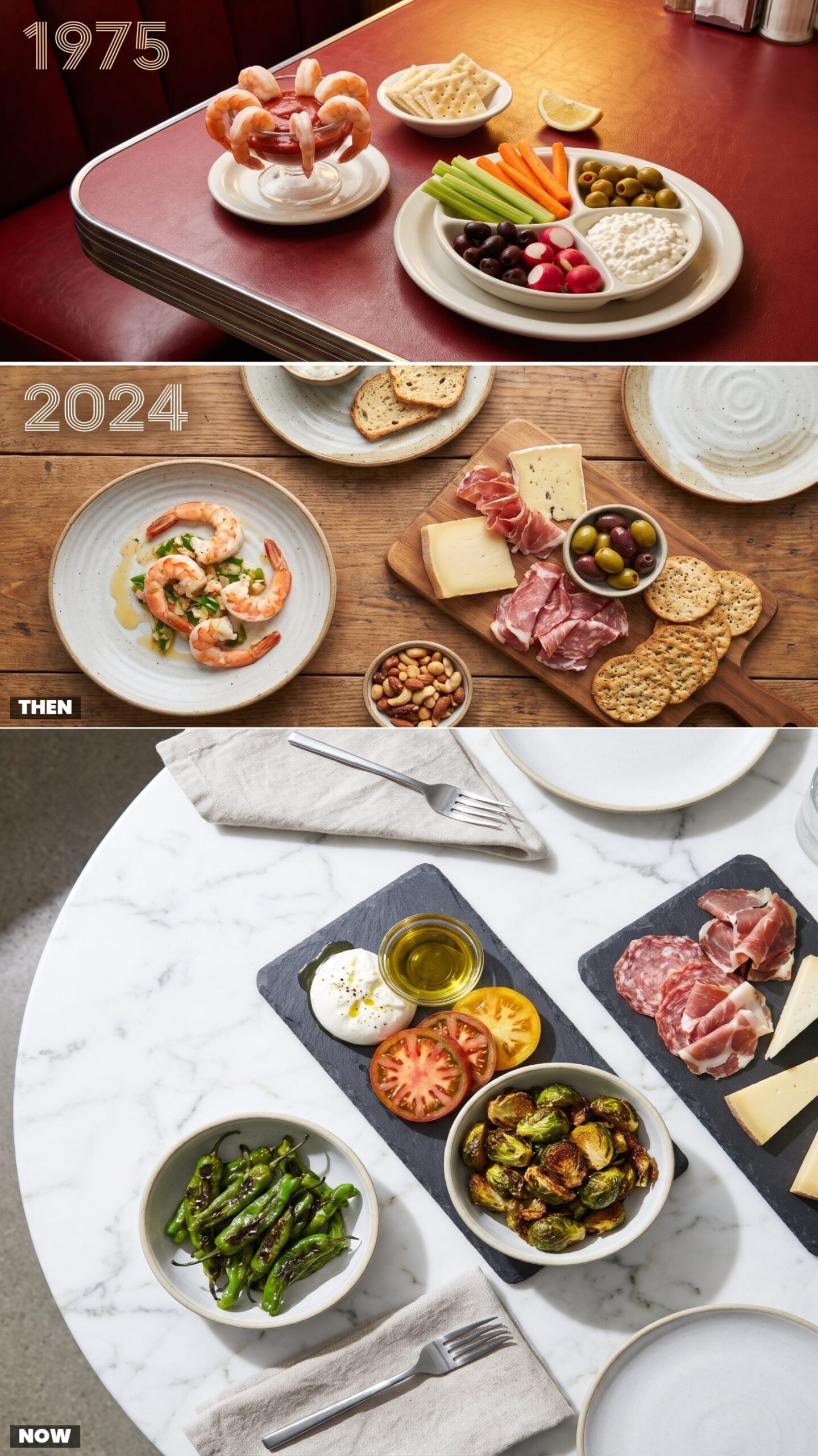
The relish tray was the appetizer nobody ordered but everybody picked at. Cold celery, two kinds of olives, a scoop of cottage cheese for reasons lost to time. And the shrimp cocktail in its tulip glass, six shrimp draped over the edge like they were posing for a photo. It felt fancy. It was fancy, for a Tuesday in 1975.
Now the table fills with shareable plates meant to be passed around and photographed first — burrata, blistered peppers, a board of cured meats. More flavor, more variety, less ceremony. The shrimp don’t drape anymore. They just sit in a bowl.
26. Salad Bars: The Unlimited Trough vs. The Composed Premium Bowl
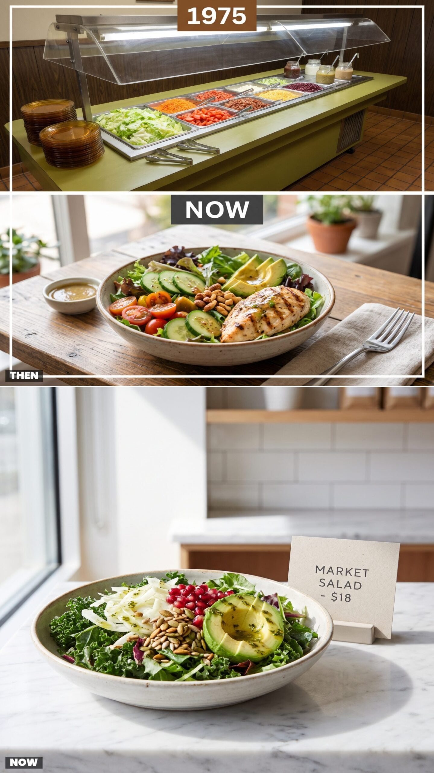
You got up and built your own, as many trips as you dared. Iceberg, a ladle of ranch that had been sitting out, bacon bits by the fistful, those little kidney beans nobody can explain. The sneeze guard was the only thing standing between you and civilization, and the whole thing was gloriously, unapologetically unlimited.
The salad now arrives composed and priced per bowl, each ingredient placed with intention, pomegranate seeds counted out like they’re being rationed. Better food, no question. It’s also eleven dollars and you only get the one. Something was lost when we stopped getting up for seconds.
The salad bar wasn’t about salad. It was about abundance you could walk up and take.
For what it’s worth, salad pictures get fewer hearts from our readers than the other images in the same articles, 47% against 68%.
25. Diet Plates: Cottage Cheese and a Peach Half vs. the Macro-Counted Meal
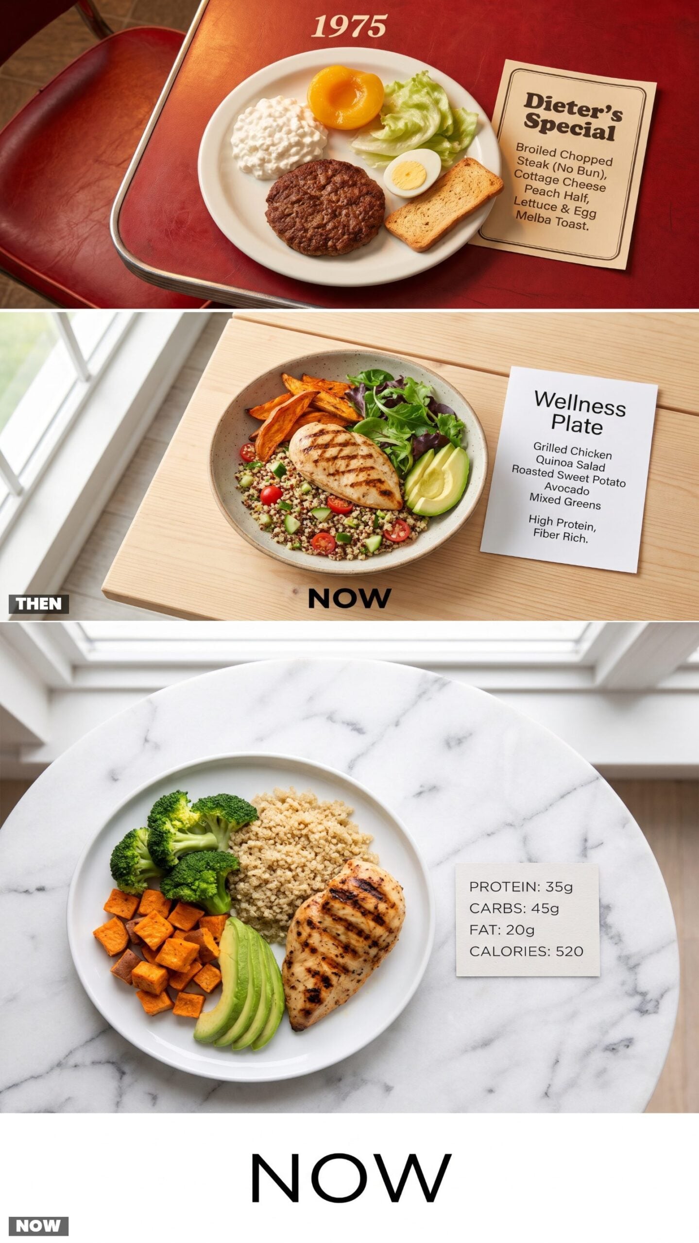
The diet plate in 1975 was punishment disguised as lunch. A bare hamburger patty, a sad scoop of cottage cheese, a canned peach half glistening in its syrup, and one melba toast cracker for crunch. Someone decided this was what watching your weight looked like, and the whole country just went along with it.
The modern version counts your macros for you. Grilled chicken, quinoa, roasted sweet potato, with the grams of protein printed right on the card. It tastes like actual food. Nobody’s syrup-poaching a peach to make you feel virtuous anymore, and honestly, good riddance.
24. Plant-Based Proteins: The Steamed Vegetable Plate vs. the Bleeding Meatless Burger
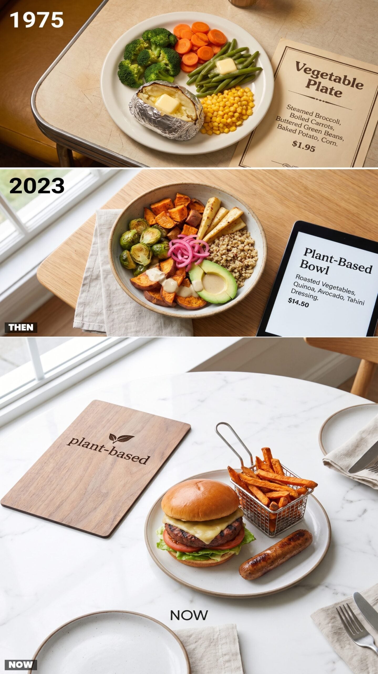
If you didn’t eat meat in 1975, the menu offered you a vegetable plate — steamed broccoli, boiled carrots, a baked potato, and whatever else the kitchen had that wasn’t an animal. It was an afterthought, and everyone treated it that way. Vegetarians ordered it with a kind of resigned patience.
Now the meatless option bleeds, sizzles, and comes dressed as a burger with a side of plant-based sausage. It wants to be mistaken for meat, and it nearly is. That little leaf icon on the menu signals a whole category that didn’t exist back when ‘vegetable plate’ was the only box to check.
23. Allergen Information: The Great Unlisted Mystery vs. the Detailed Allergy Key
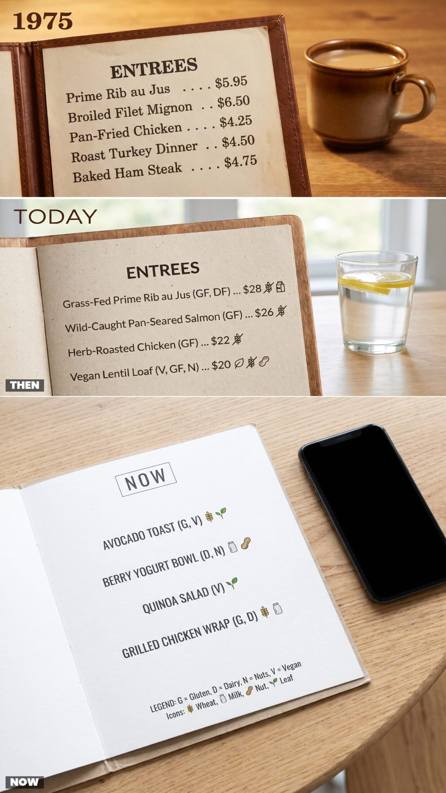
You ordered on faith. The menu gave you the name of the dish, the price, and nothing else. If you had a nut allergy you asked the waitress, who asked the cook, who shrugged, and half the time nobody really knew what was in the gravy. People with real allergies lived dangerously, and not by choice.
The menu now reads like a chemistry label. Little icons flag gluten, dairy, nuts, shellfish, with a legend at the bottom decoding it all. It looks busy. But if those symbols had existed in 1975, a lot of people would have had far fewer frightening nights out.
22. Calorie Counts: Blissful Ignorance vs. a Number Next to Every Dish
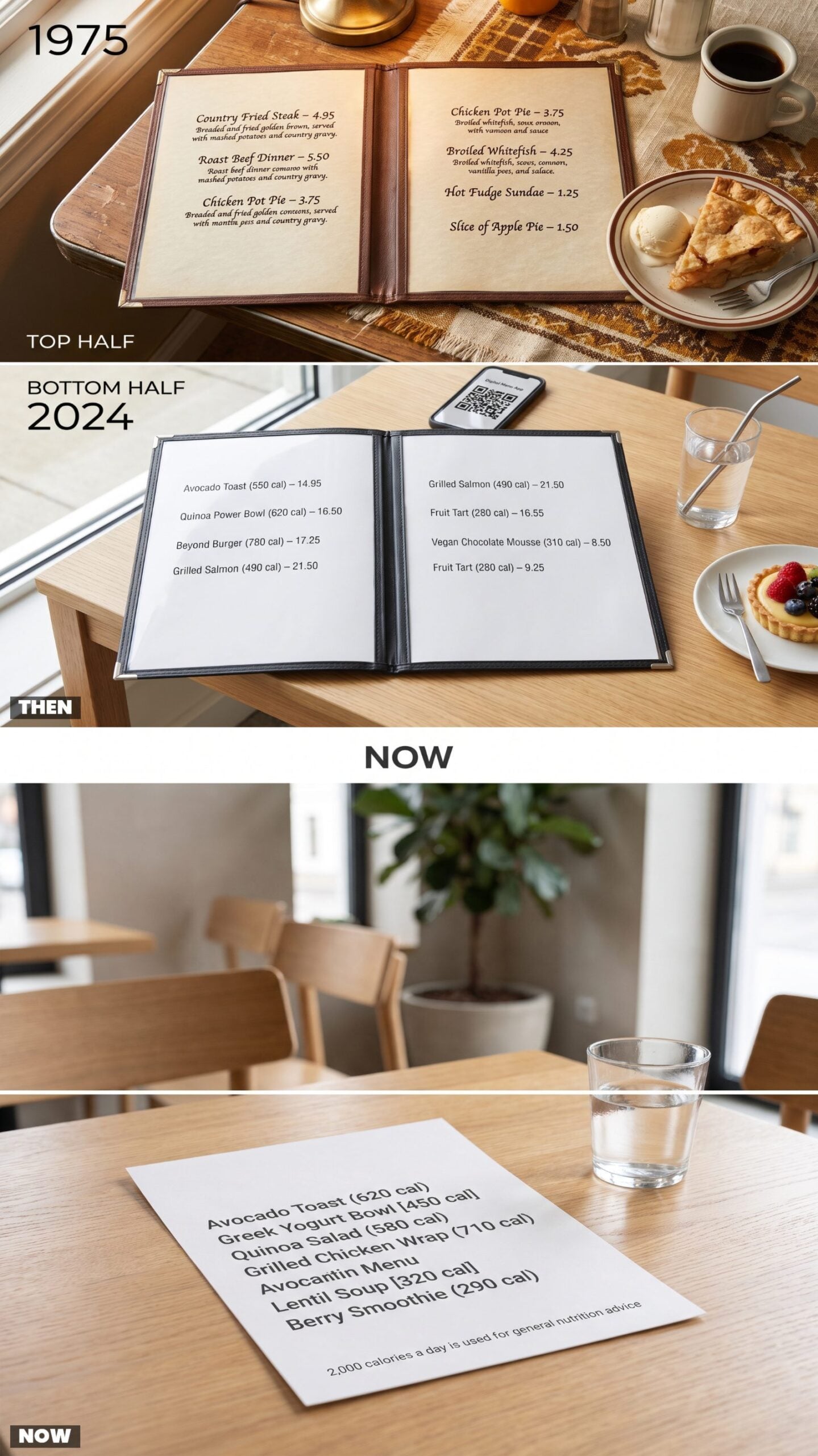
Nobody told you the hot fudge sundae was going to cost you anything but the price. You ordered the country fried steak, ate it happily, and never once did the math. The menu described the food in loving detail and left the rest entirely to your imagination.
Now the number sits right there beside the name, bold and unignorable — six hundred-something calories for the thing you were about to order without a second thought. Some people call it helpful. Some call it a mood killer at exactly the wrong moment. I’ll let you pick a side.
21. Ingredient Origins: ‘Farm Fresh’ Meant Nothing vs. the Named Farm Down the Road
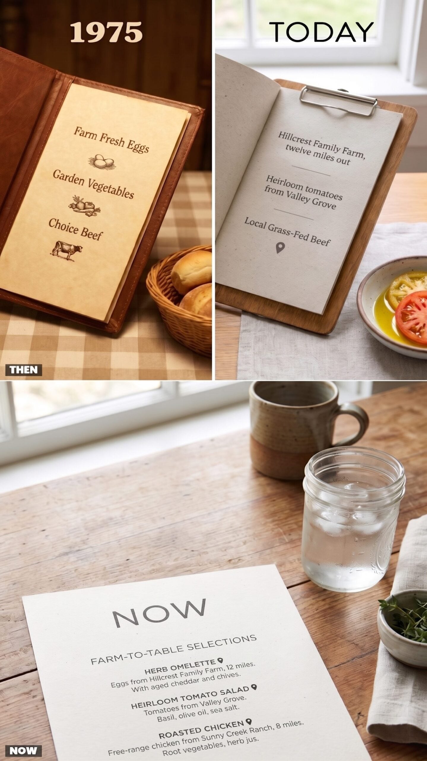
‘Farm Fresh’ was the extent of it. The eggs came from a farm, presumably. The beef was ‘choice’, which told you nothing. The menu waved its hand at wholesomeness and trusted you not to ask which farm, which valley, which anything. And you didn’t, because nobody did.
The menu now names names. Eggs from Hillcrest Family Farm, twelve miles out. Heirloom tomatoes from Valley Grove. There’s a little pin icon, like a treasure map. It’s lovely, and it’s also marketing, and both of those things can be true at once.
20. Portion Language: ‘Hearty’ and ‘Jumbo’ vs. Exact Ounces on the Plate
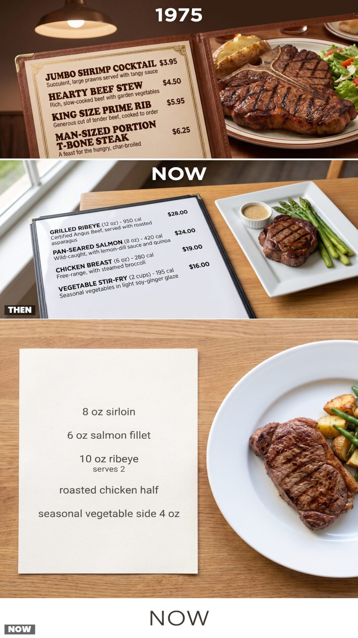
Outside the steak section, portions came in moods, not measurements. ‘Hearty.’ ‘Jumbo.’ ‘King Size.’ And ‘Man-Sized Portion’, which restaurants printed without a trace of irony. You had no idea how much food was coming. You just knew it would be a lot, and it usually was.
Now the menu tells you it’s an eight-ounce sirloin, or a six-ounce fillet, or that it serves two. Precise, honest, a little clinical. The hype words are gone, and you know exactly what you’re getting before it arrives. Handy, though ‘Man-Sized Portion’ had a swagger that ‘8 oz’ will never touch.
19. Substitutions: The No-Changes Rule vs. Build-It-Your-Way
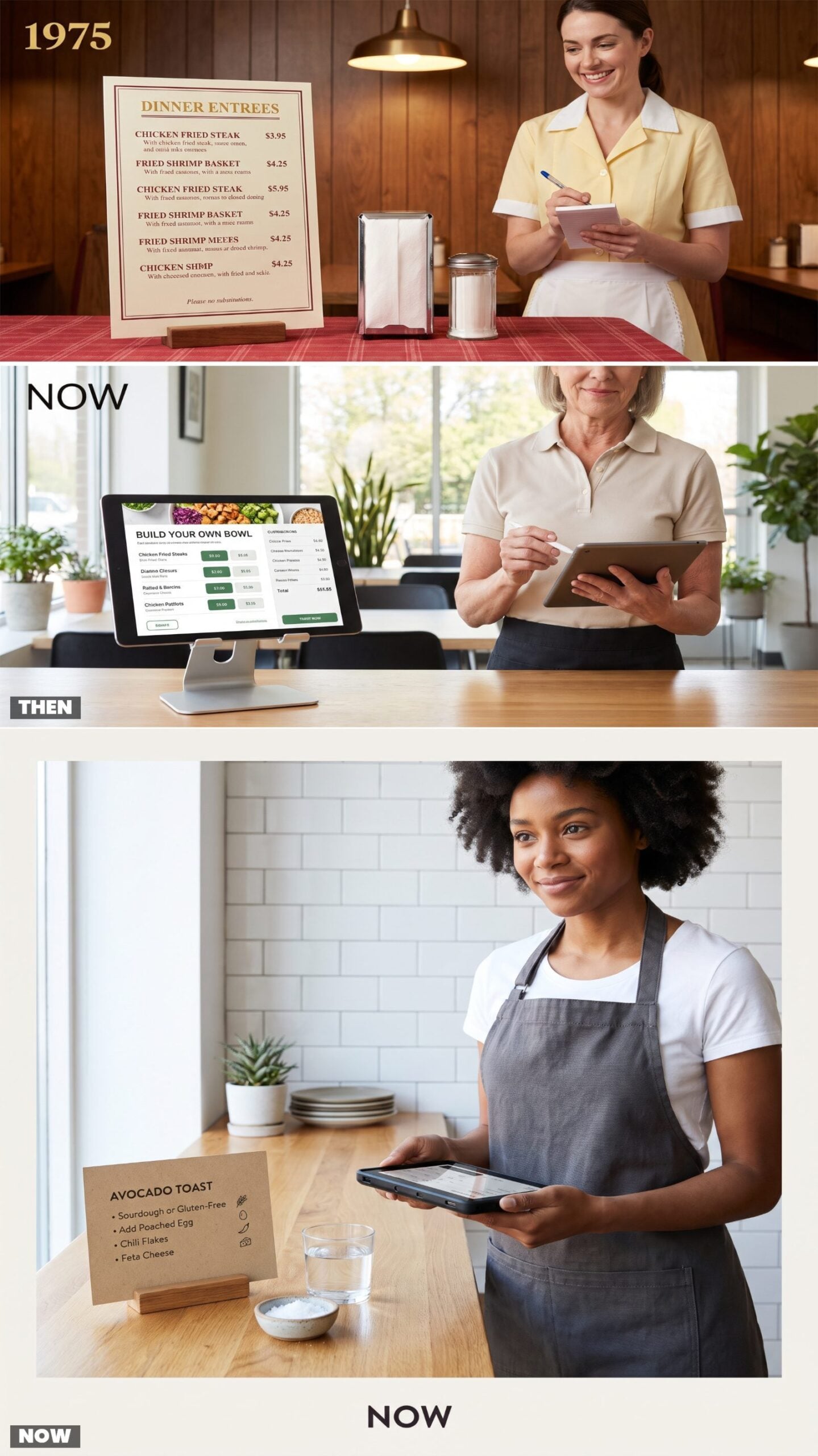
Ask for dressing on the side in 1975 and you got a look. The menu often spelled it out in small italics along the bottom: substitutions kindly declined. The kitchen ran like a factory line, and your personal preferences weren’t on the schematic.
Now the menu reads like a questionnaire. Swap the fries, hold the onion, add avocado, sub the bun for a lettuce wrap. Every order turns into a conversation, and the tablet in the server’s hand remembers all of it.
18. Side Dishes: Your Potato Arrives, Decisions Optional
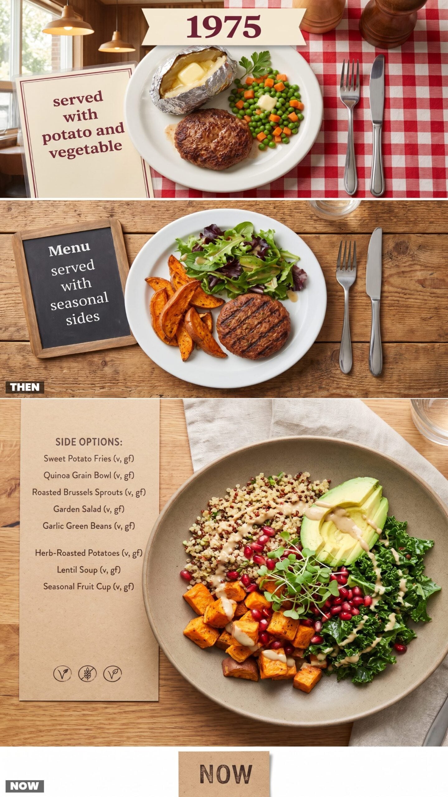
The potato showed up whether you wanted it or not — foil-wrapped, split down the middle, a pat of butter already surrendering to the heat. Next to it sat a modest scoop of peas and carrots that nobody chose and nobody questioned. The menu said “served with potato and vegetable,” and that was the whole negotiation.
Today the sides get their own column. Sometimes their own page. Sweet potato fries, grain bowls, roasted brussels sprouts, a side salad with four dressing options to pick through before you’ve even settled on the main thing, which by then feels like an afterthought to all the choosing.
17. Kids’ Menus: A Tiny Steak vs. A Placemat You Can Color
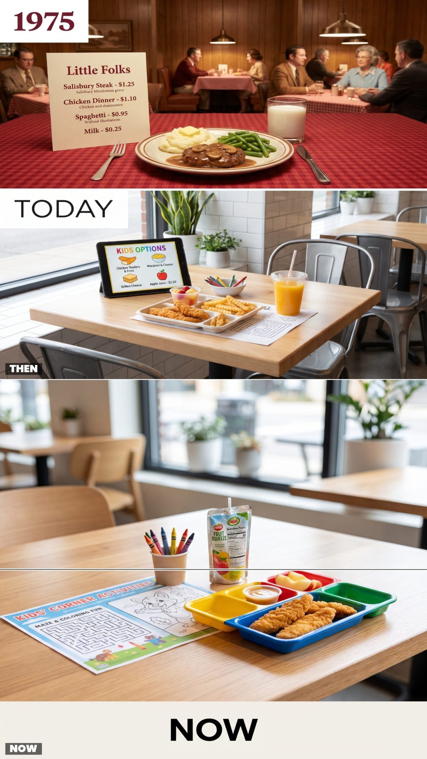
A kid’s dinner in 1975 was just a shrunken version of what the grown-ups got: a little Salisbury steak, a dollop of mashed potatoes, green beans nobody touched. The menu listed it plainly under “Little Folks,” no cartoons, no crayons.
Now the children’s menu is a product in its own right. Branded placemats, mazes, a mascot, a cup of crayons, and food that shows up in a compartment tray shaped like a cartoon face.
16. Breakfast: Eggs, Toast, Coffee vs. Breakfast at Four in the Afternoon
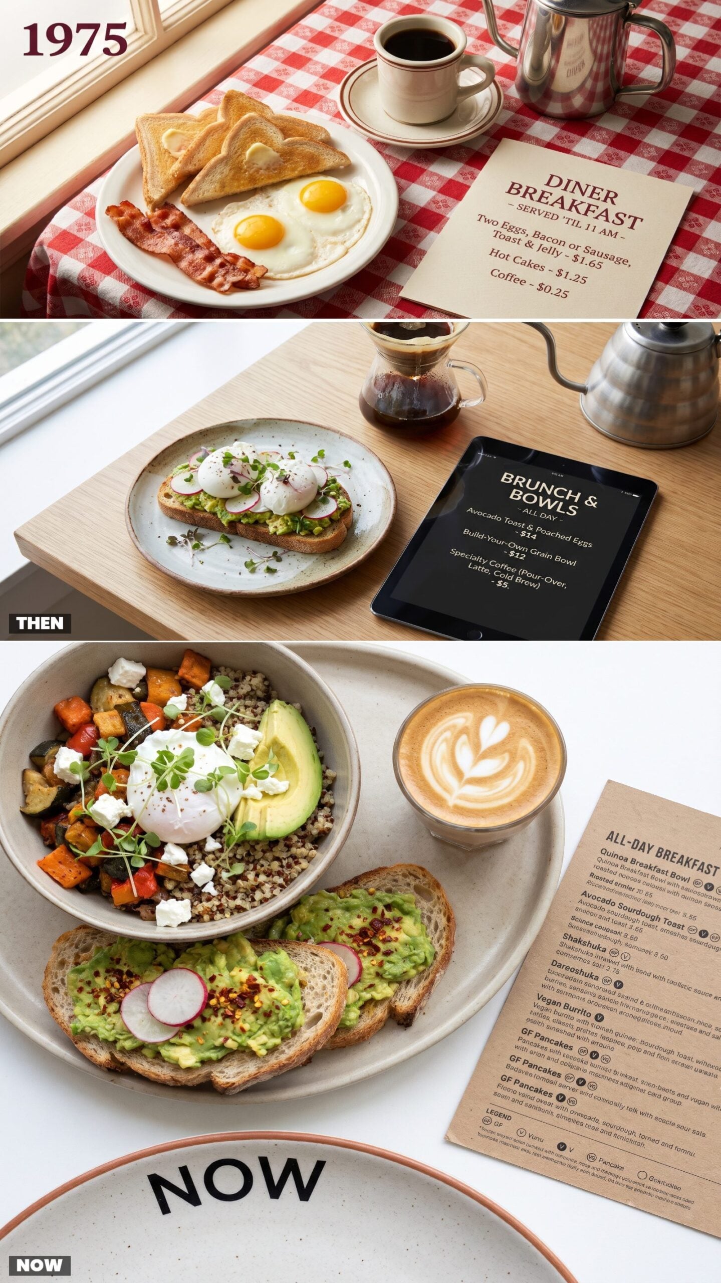
Breakfast had a bedtime. You ate eggs, toast, and coffee before eleven, and after that the grill moved on to lunch whether your stomach agreed or not. The menu backed it up — a short morning column, prices under two dollars, no arguing about timing.
Now breakfast runs all day and most of the night. Build-your-own bowls, avocado toast, a latte served in a glass instead of a mug. The clock stopped mattering somewhere around the time “brunch” went mainstream.
15. Brunch: The Sunday Hotel Spread vs. Benedict Everything
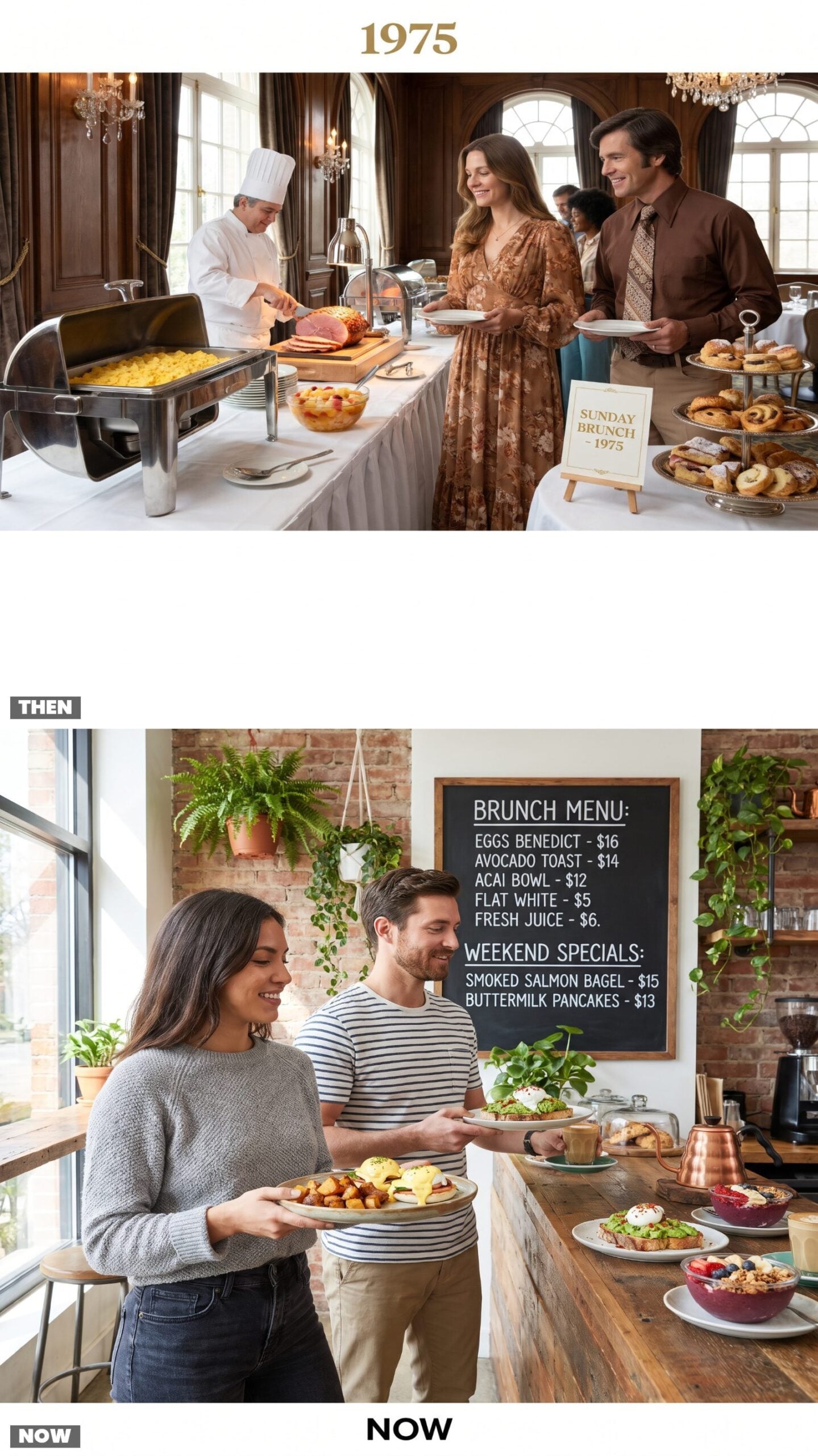
Brunch used to mean the hotel on a Sunday. A carving station, a chafing dish of scrambled eggs going slightly rubbery under the heat lamp, and a bowl of fruit cocktail that came out of a can. You dressed up. There was a chandelier involved.
Now it’s a weekly religion with its own vocabulary — benedicts stacked four ways, avocado smashed on sourdough, acai bowls, bottomless mimosas. The chalkboard menu changes faster than the tablecloths ever did.
Brunch stopped being an occasion and became a personality.
14. Burgers: Hamburger or Cheeseburger vs. The Architectural Stack
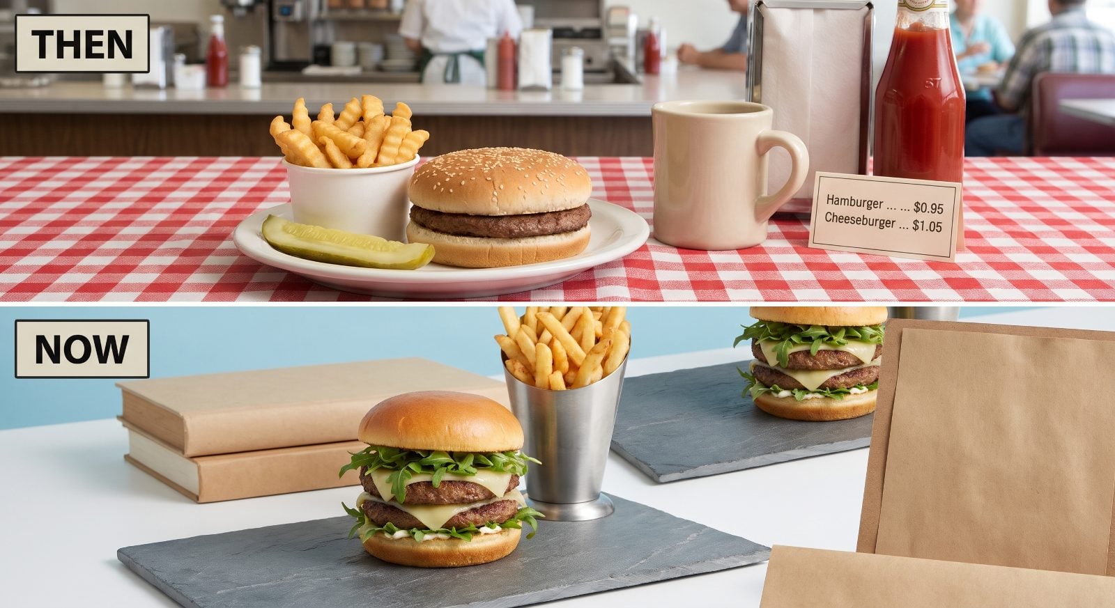
The burger menu was two lines long. Hamburger or cheeseburger. The difference was one slice of American, and the difference in price was a dime. It came on a plain bun with a pickle spear, and that was the extent of the drama.
Now burgers have names and backstories. Double smash patties, gruyere, a tangle of arugula, a brioche bun perched on a stack so tall gravity is barely holding on. The menu describes each one like a character in a novel.
13. Steaks: Cut and Weight vs. The Full Biography of a Cow
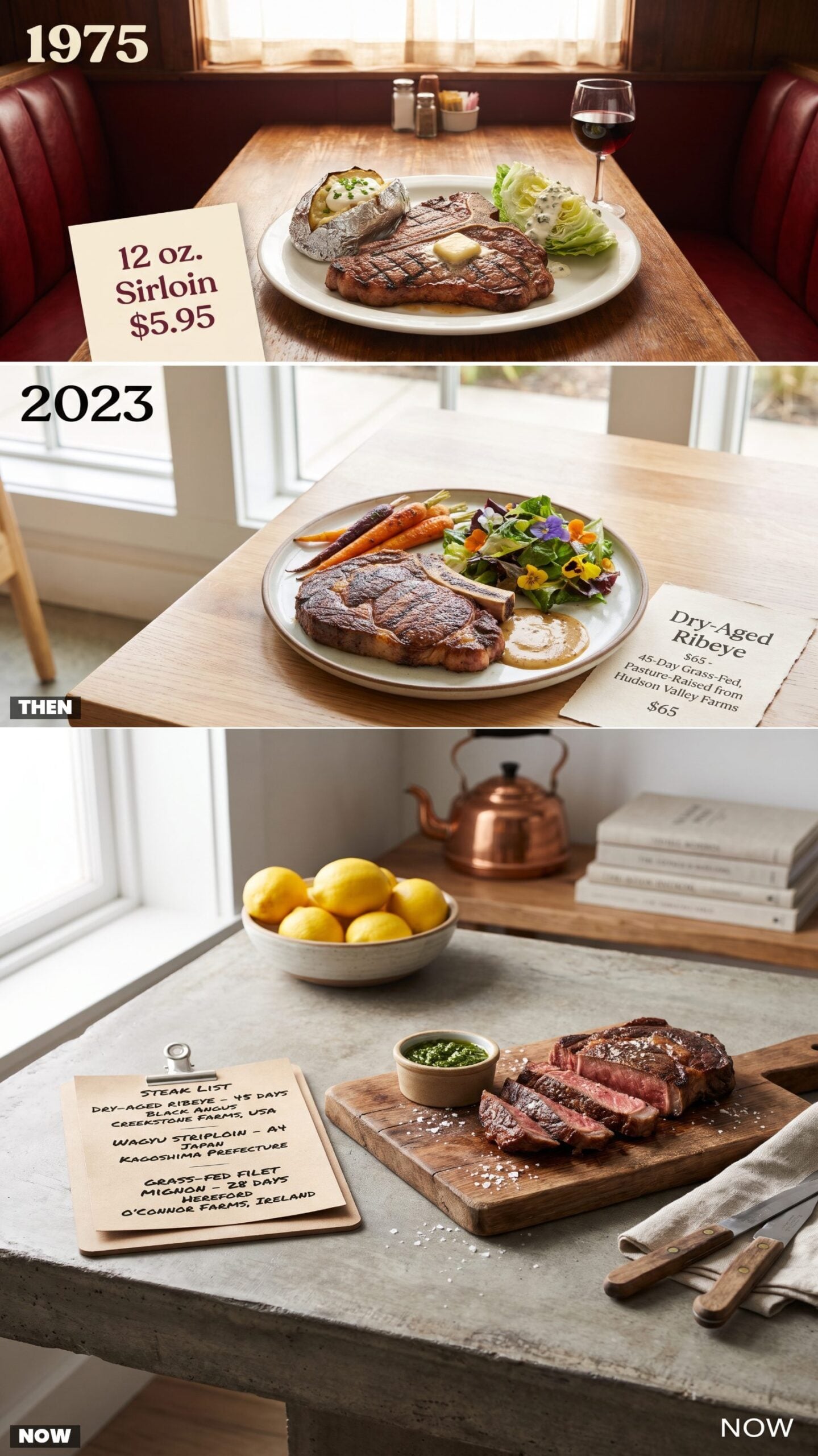
A steak in 1975 told you two things: the cut and the weight. Twelve-ounce sirloin. Sixteen-ounce T-bone. You ordered by size, it arrived sizzling next to a foiled potato and an iceberg wedge, and nobody mentioned where the animal grew up.
Now the steak comes with a resume. Dry-aged forty-five days, grass-fed, a named farm two counties over, the breed printed right there on the page. The cut is almost the least of what they want to tell you.
12. Seafood: The Fried Platter vs. Species-and-Sustainability Footnotes
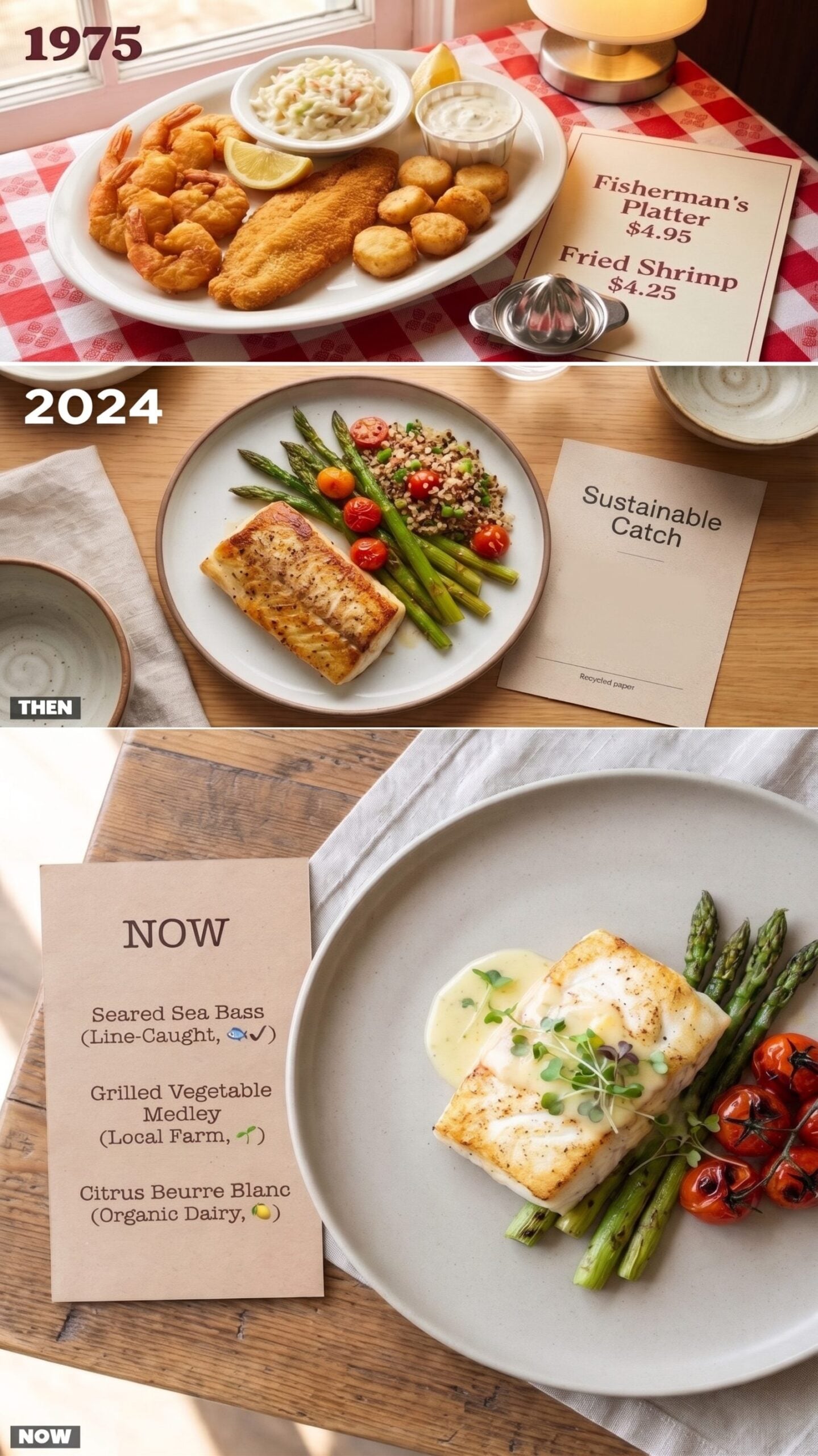
Seafood meant fried, mostly. The Fisherman’s Platter piled shrimp, scallops, and a fish fillet all breaded the same golden color, with coleslaw and a paper cup of tartar on the side. The menu rarely bothered to name the species. Fish was fish.
Now the menu reads like a field guide — the exact species, how it was caught, a little icon swearing the fishery is responsible. The fish arrives seared, not battered, and plated like it has somewhere to be.
11. Pizza: Three Toppings and a Prayer vs. The Specialty Pie Collection
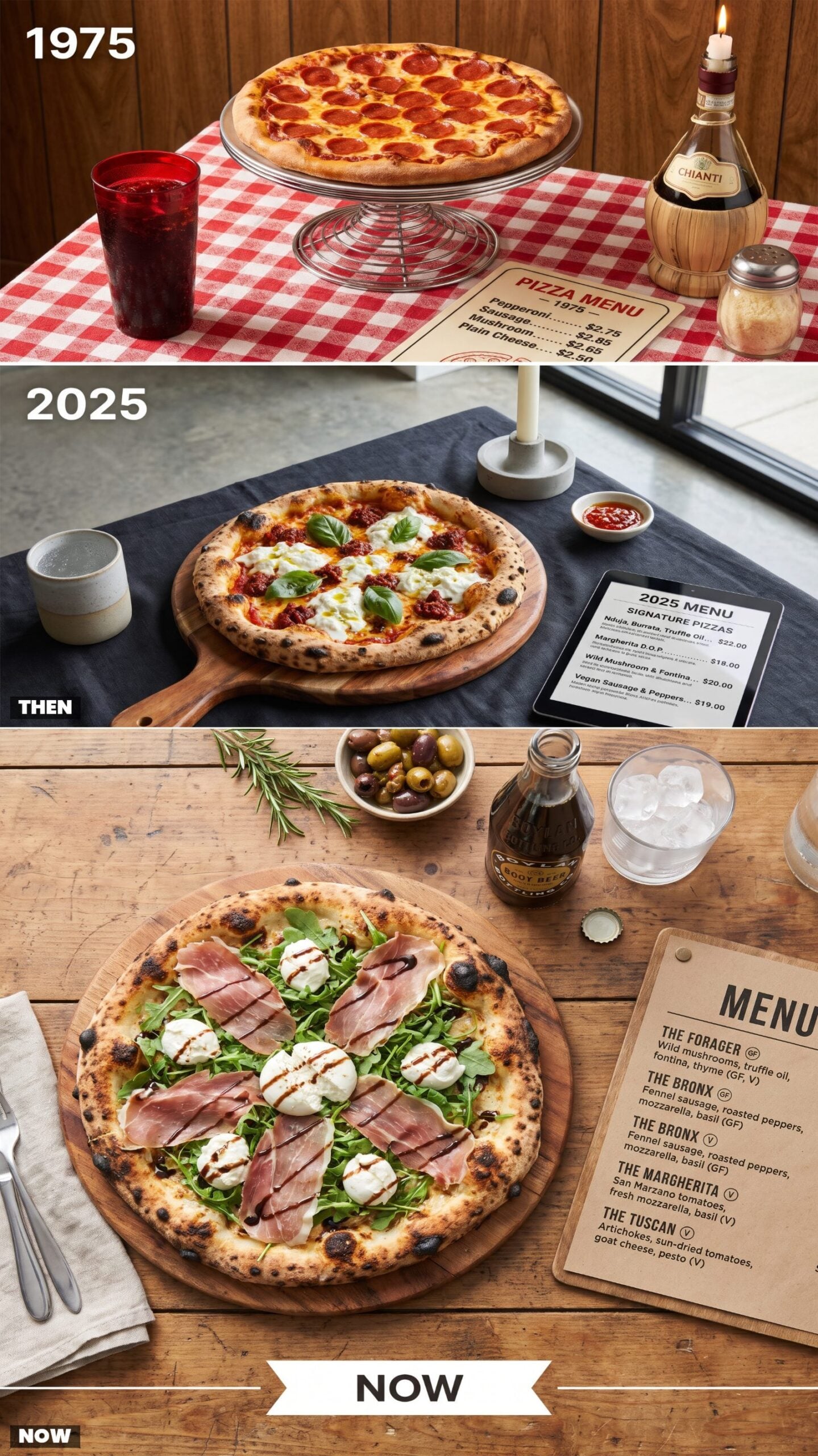
The topping list fit on half a card. Pepperoni, sausage, mushroom, maybe green pepper, plain cheese for the picky ones. You pointed, the pie came out on a chrome pedestal stand, and a shaker of parmesan plus one of red pepper flakes did the rest. The Chianti bottle with the candle jammed in it was decoration, not a wine list.
Now there’s a specialty collection with names and whole paragraphs behind them. Prosciutto and arugula, burrata and balsamic, a vegan one with cashew cheese. The pizza shows up on a wooden board under a drizzle, and the menu assumes you want a story with dinner.
10. International Dishes: Americanized Specialties vs. The Real Regional Name
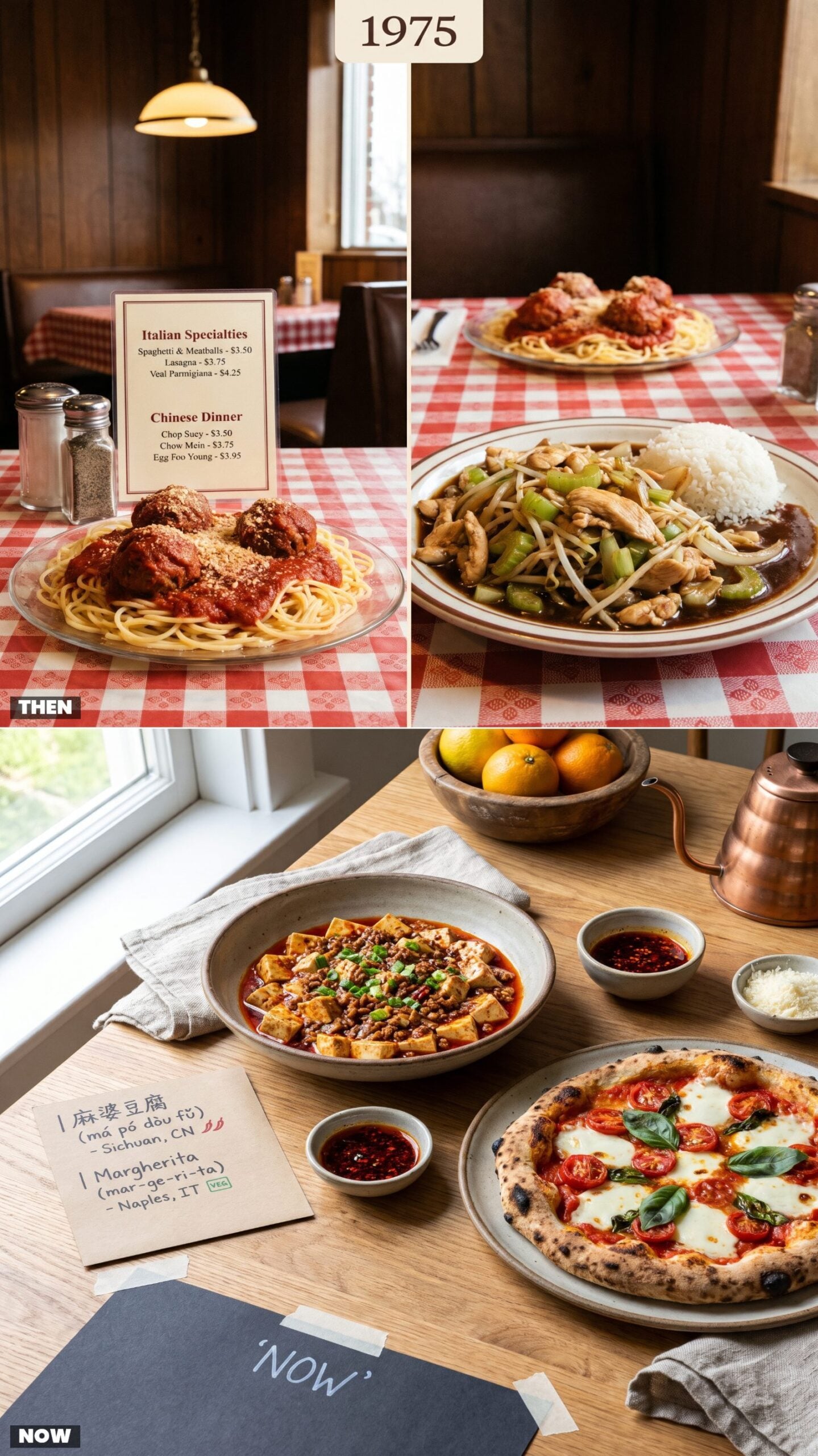
International food in 1975 came flattened into categories. “Italian Specialties” meant spaghetti and meatballs. “Chinese Dinner” meant chop suey and an egg roll under one umbrella, country of origin optional. The menu painted with the broadest brush it owned, and most diners never knew what they were missing.
Now the menu names the region, sometimes the specific province. Sichuan, not “Chinese.” Neapolitan, not “Italian.” Dishes keep their real names, with a pronunciation guide and a line about where the recipe actually comes from.
9. Dessert Menus: Pie, Pudding, and Spumoni vs. Dessert Built for a Camera
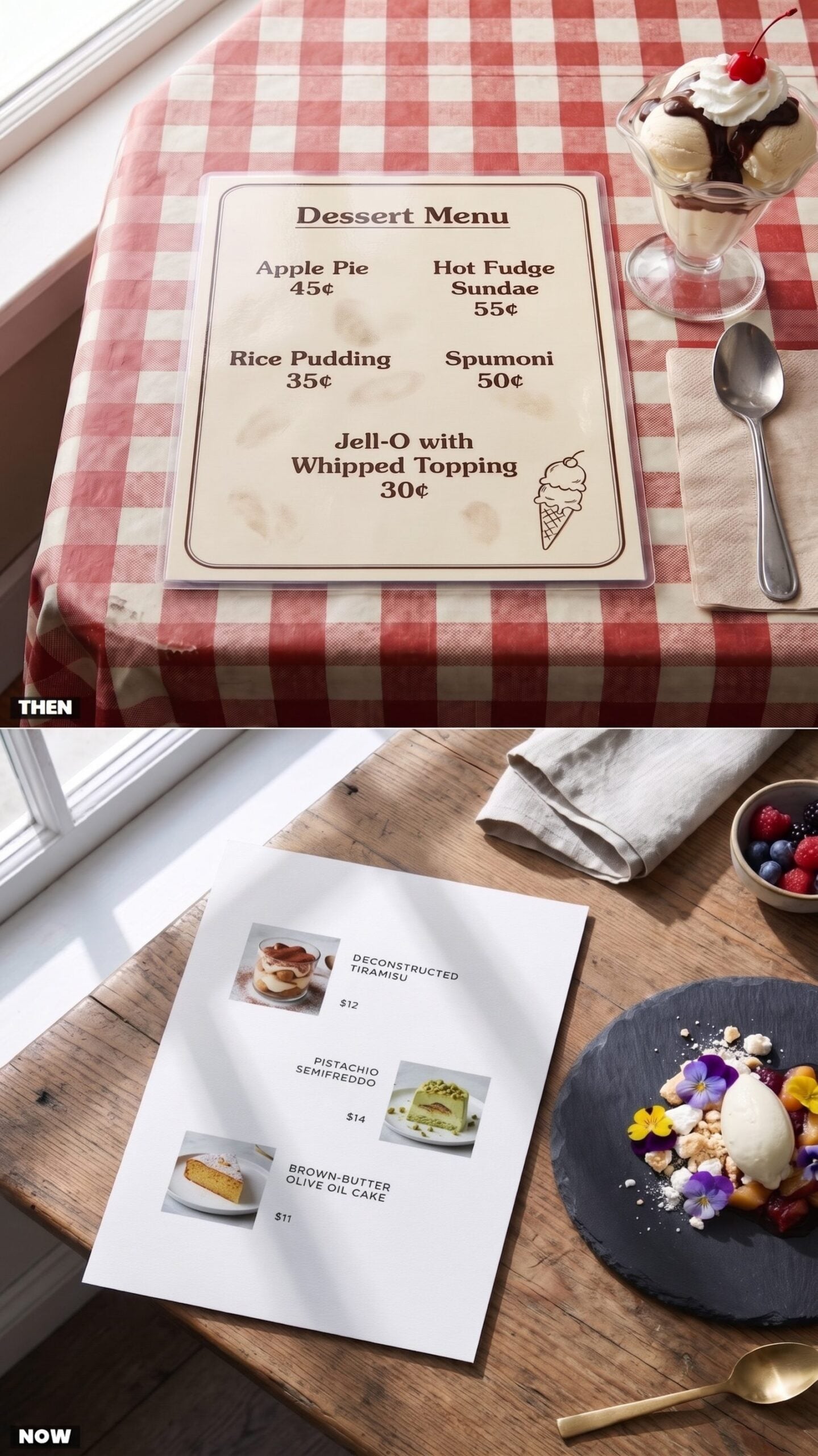
In 1975 the dessert list ran five lines long and everybody knew them cold. Pie, pudding, a hot fudge sundae, Jell-O with whipped topping, and spumoni if the place had any Italian in its blood. Nobody photographed it because nobody needed to — you pointed, it arrived, you ate it.
Now dessert has a publicist. Every sweet gets styled, lit, and shot before it ever reaches you, because it has to survive a phone before it survives a fork, and the semifreddo shows up with a backstory about which farm the pistachios came from. Prices climbed something like twentyfold. Portions shrank.
8. Coffee Listings: Regular or Decaf vs. The Espresso Spreadsheet
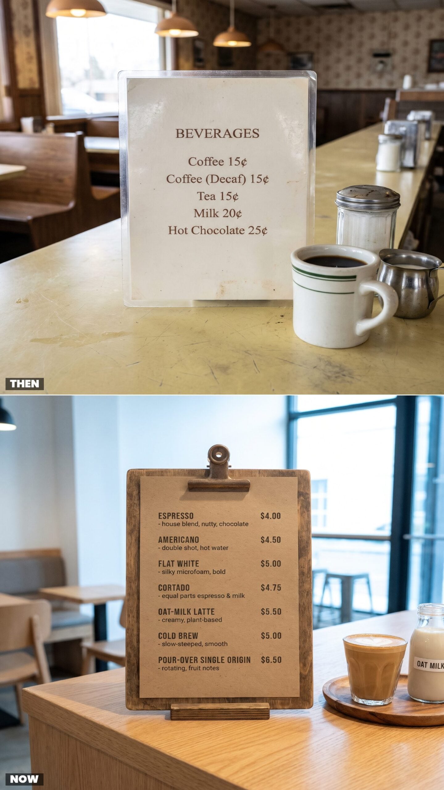
The 1975 coffee question had two answers: regular or decaf. You got a mug the color of a bathroom sink and a free refill nobody bothered to announce, because free refills were simply the law of the land.
The modern coffee menu reads like a spreadsheet with feelings. Cortado, flat white, the whole oat-milk situation, a single-origin pour-over that takes four minutes and arrives with a note about stone fruit. I love good coffee. I do not love being quizzed about my milk preference before 8am.
7. Cocktail Menus: Highballs and Slushy Pink Drinks vs. Tweezered Mixology
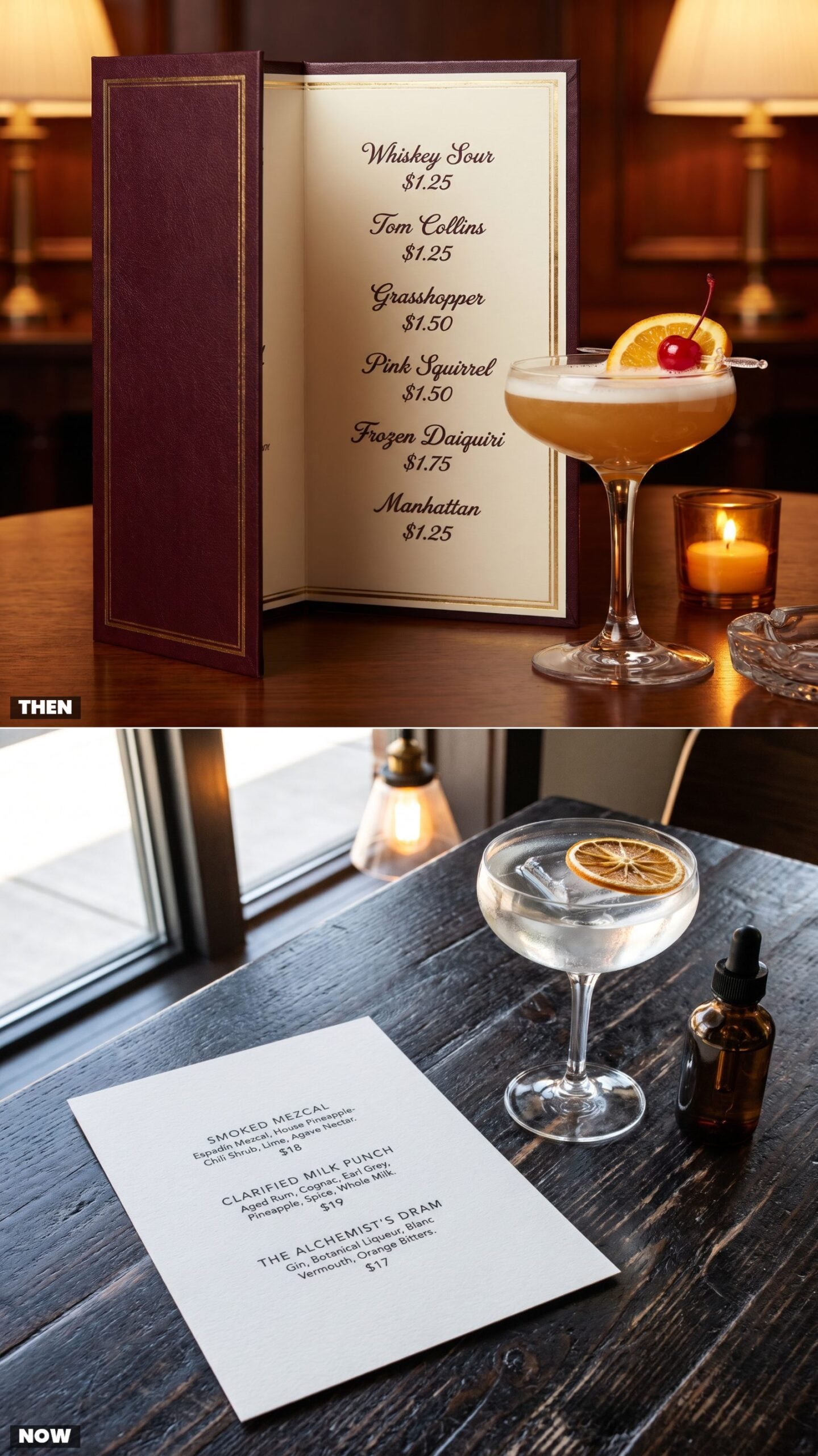
A 1975 cocktail menu trusted you to know what you were doing. Whiskey sour, Manhattan, Tom Collins, and for the adventurous table, something frozen and pink with a cutesy name and a mint-green cousin called the Grasshopper. A buck and a quarter, no ingredient list, because the list was the name.
Today’s cocktail runs four lines of small print — house shrub, clarified milk punch, some smoke technique, a garnish placed with tweezers. It costs seventeen dollars and shows up with one enormous perfect ice cube that cost more to freeze than the whole 1975 round.
6. Wine Lists: House Red, House White, or a Carafe vs. The Regional Encyclopedia
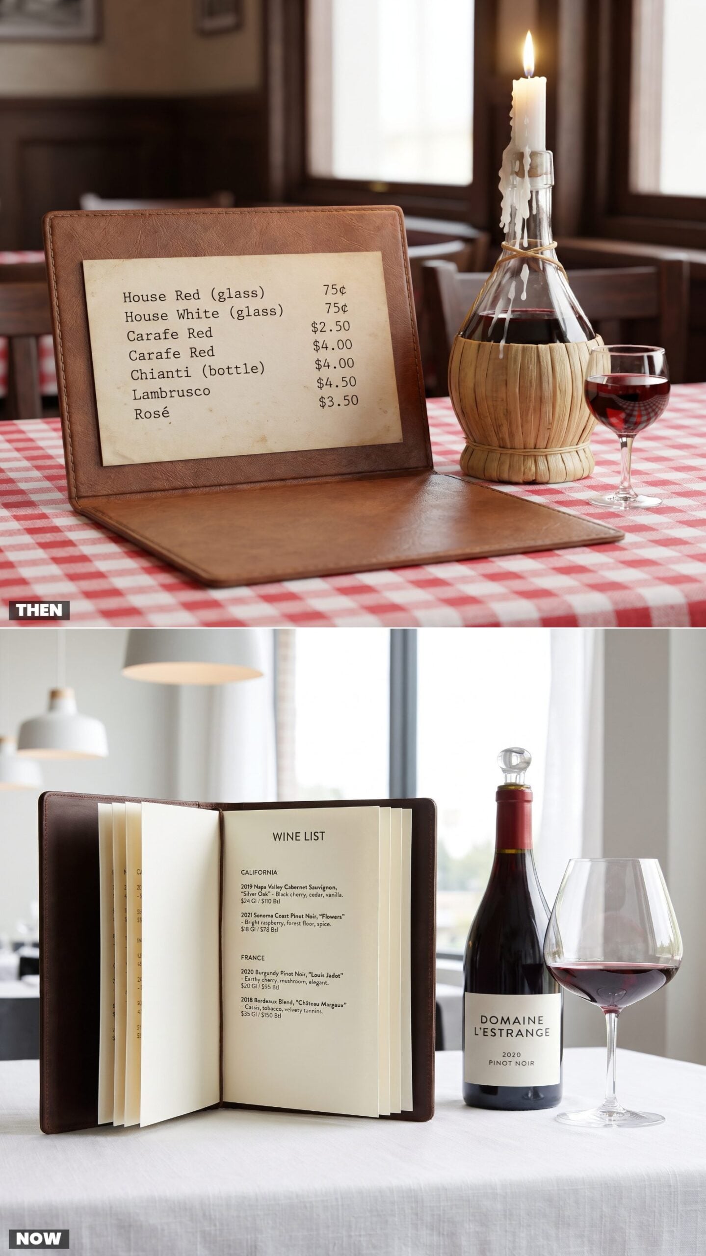
There was a dignity to the 1975 wine list. House red, house white, or if you were feeling it, a carafe. The fancy move was a straw-wrapped Chianti bottle you’d later turn into a candle holder, dripping wax down the straw for years. Seventy-five cents a glass. Nobody asked about terroir.
The modern version is a book — regions, varietals, vintages, tasting notes written by someone who clearly had a great time writing them, pairings suggested whether you wanted them or not. A glass now costs what a whole carafe used to, and that straw-wrapped bottle has become a vintage decor item people actually pay money to track down.
5. Beer Lists: Domestic Bottles in a Line vs. The Rotating Draft Chalkboard
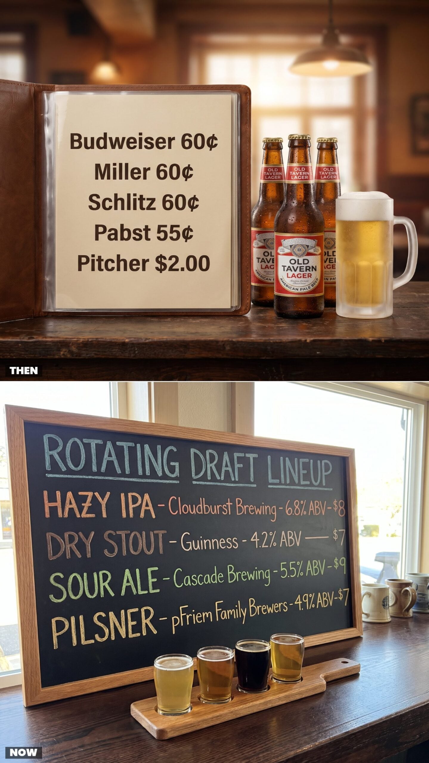
Beer in 1975 was brand loyalty, not research. Bud, Miller, Schlitz, Pabst — all domestic, all lager, all around sixty cents a bottle, and all tasting roughly the same if we’re being honest about it. A pitcher ran two bucks and fed the whole table.
Now the draft list rotates weekly on a chalkboard, complete with ABV percentages, a style, and a brewery an hour away you’ve somehow never heard of. You order a flight so you don’t have to commit to anything. One hazy IPA costs more than the entire 1975 pitcher. Progress, probably.
4. Takeout Menus: Folded Counter Flyers vs. The Menu That Lives in Your Pocket
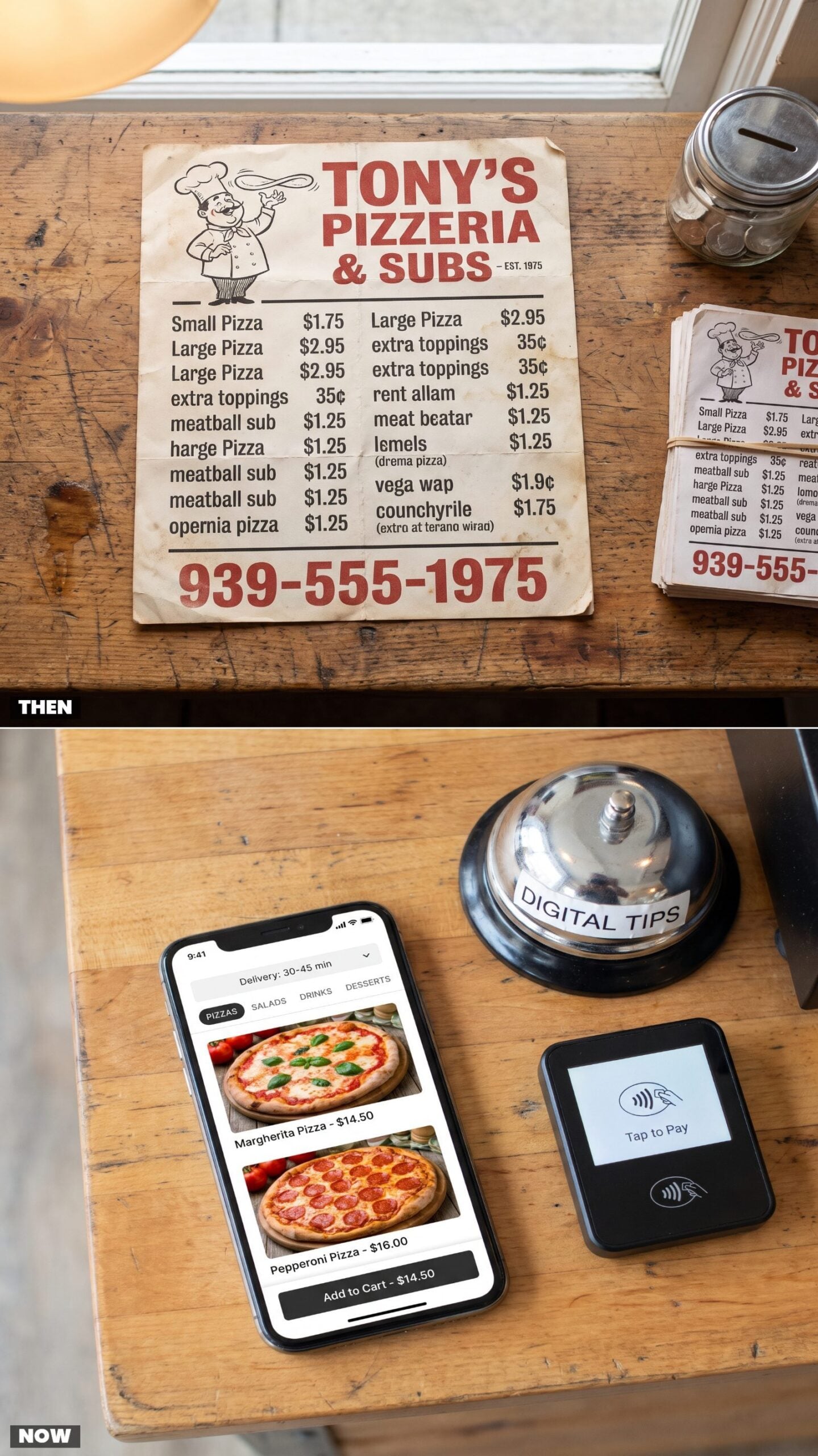
The takeout menu used to live in a drawer, folded in thirds and splattered with sauce from the last three orders. You grabbed it off a stack by the register, the phone number printed huge because calling was the only way in. Half of them were fridge magnets you never once used.
Now the menu lives in your pocket. It loads on a phone, scrolls with your thumb, shows you a photo of everything, and quietly remembers your last order. Faster, cleaner, no sauce stains. But nobody keeps a mobile ordering page stuck to the fridge for eleven years.
3. Drive-Through Boards: Hand-Changed Plastic Letters vs. Animated Digital Screens
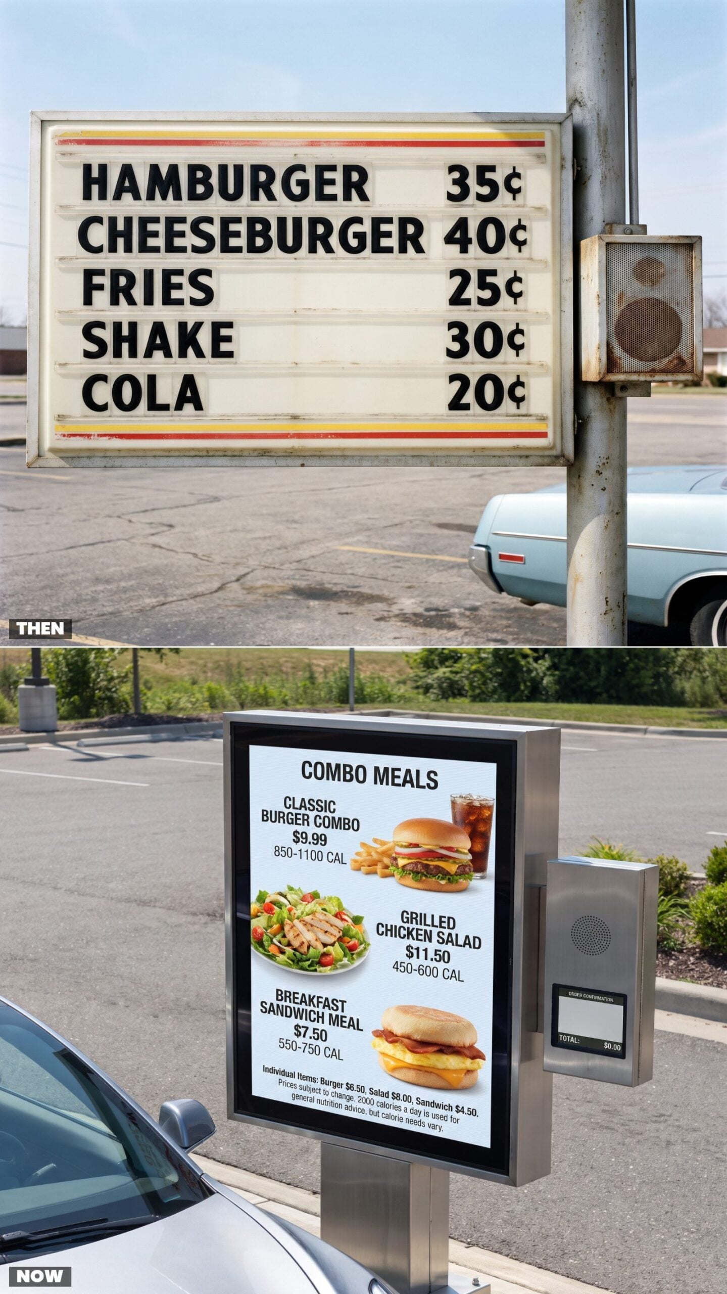
Somebody had to climb up with a box of plastic letters and spell out the whole menu by hand. That’s why the drive-through board in 1975 had crooked spacing and the occasional backwards N nobody got around to fixing for a week. Prices changed slowly because changing them was a chore.
Now the board is a glowing screen that cycles animated combos, posts calorie counts, and updates prices from an office somewhere the instant beef gets expensive. No ladder. No box of letters. No charming little typo to squint at while the speaker crackled at you.
2. Self-Service Menus: The Cashier’s Overhead Board vs. The Touchscreen Kiosk
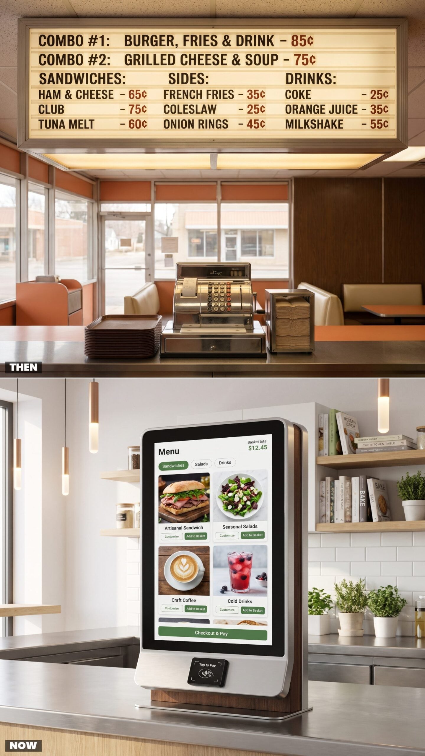
You walked in, looked up, and read the glowing board over the cashier’s head while the line shuffled forward. The cashier punched round buttons on a chrome register, called your order back to the kitchen, and the whole transaction ran on eye contact and a brown plastic tray.
The eye contact is gone. A touchscreen stands where a person used to stand, upselling you fries with a cheerful button and asking about dessert twice. Faster lines, no small talk. And a quiet psychological trick underneath it all: screens get people to order more than any cashier ever could, because nobody feels judged by a screen.
1. QR-Code Menus: A Printed Page You Could Hold vs. The Scan-to-Order Table Card
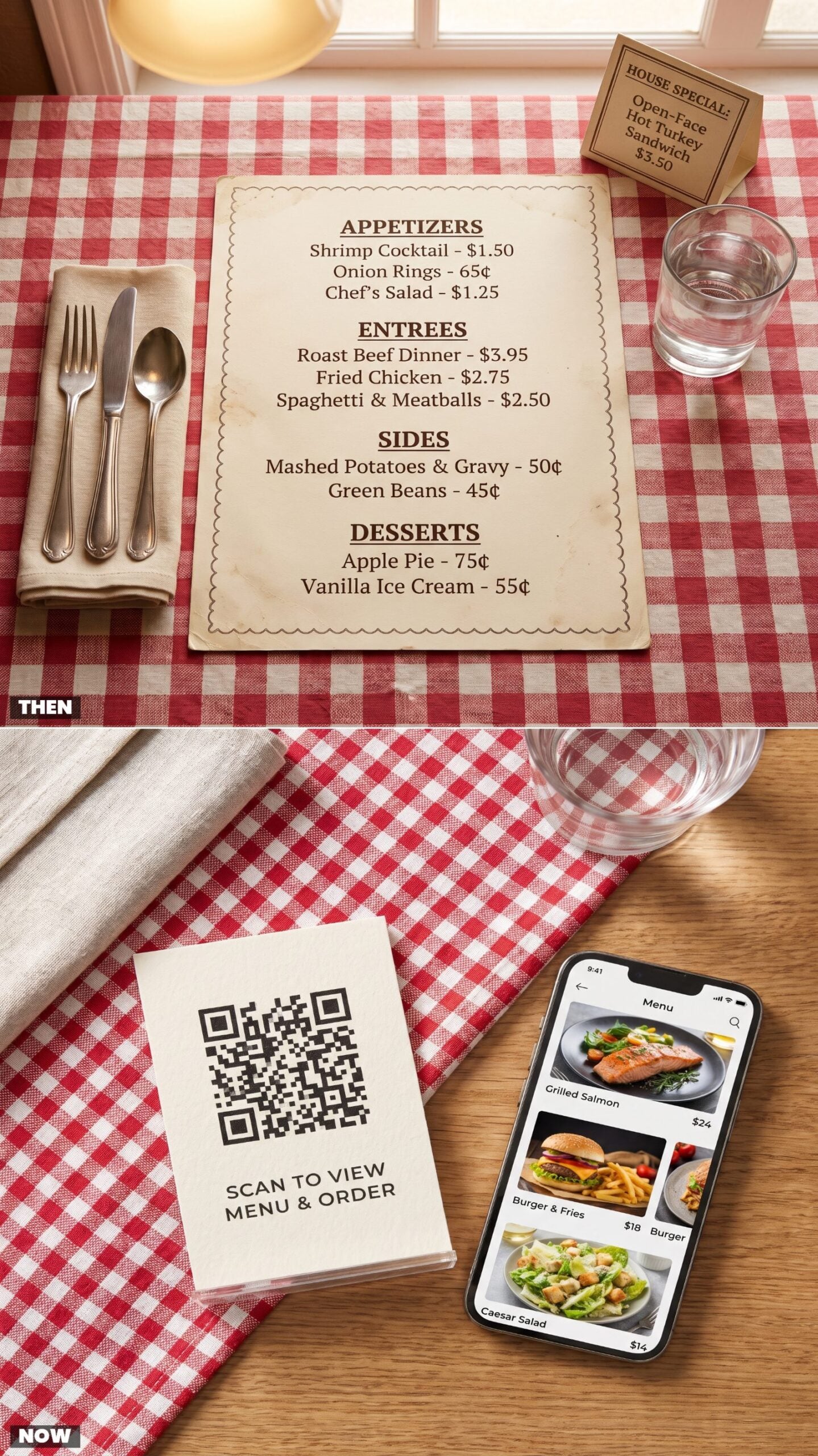
The old menu was a thing you held. Padded vinyl, a gold tassel, serif headings for Appetizers and Entrees, a little grease smudge near the pizza section from whoever had the table before you. You read it across the table, pointed at it, argued over it. It was part of the meal.
Now a small card stands on the table with a square you scan, and the menu loads on your own phone. No printing costs, no reprints when prices jump — which they do more freely these days, since changing a number costs nothing. Convenient, sure. But there’s no shared object anymore, nothing to point at together. Just two people hunched over separate screens at the same table.